
7 Ways to Use Retro 80s Colour Palette for Vintage Style
- Jan 16
- 9 min read
Bold colour choices defined the British design scene in the 1980s, with vibrant neon and pastel palettes capturing the spirit of rebellion and self-expression. More than 60 percent of vintage fashion revivals in the United Kingdom now draw directly from these energetic hues. For designers and eco-conscious decorators, unlocking authentic 80s colour inspiration fuels creative innovation and sustainable retro styling. Discover how genuine 80s palettes can shape your next British vintage collection or home décor masterpiece.
Table of Contents
Quick Summary
Takeaway | Explanation |
1. Embrace Bold 80s Colours | Incorporate vibrant hues like neon greens and electric blues to express individuality and energy. |
2. Balance Neons with Neutrals | Strategically use neon shades as accents alongside neutral tones to prevent visual chaos in your space. |
3. Use Pastels with Bright Accents | Combine soft pastels with vibrant colours for a sophisticated yet playful aesthetic reminiscent of 80s design. |
4. Choose Primary Colours Thoughtfully | Select one primary colour as a statement piece to create dramatic visual impact without overwhelming your decor. |
5. Prioritise Sustainable Fabrics | Seek organic or recycled materials that capture 80s colours to align vintage style with modern environmental values. |
1. Understanding Key Colours in the 80s Palette
The 1980s were a visual explosion of vibrant, bold colour that redefined design and fashion. Understanding the decade’s distinctive palette means diving into a world of electrifying retro hues that symbolised optimism, rebellion, and self-expression.
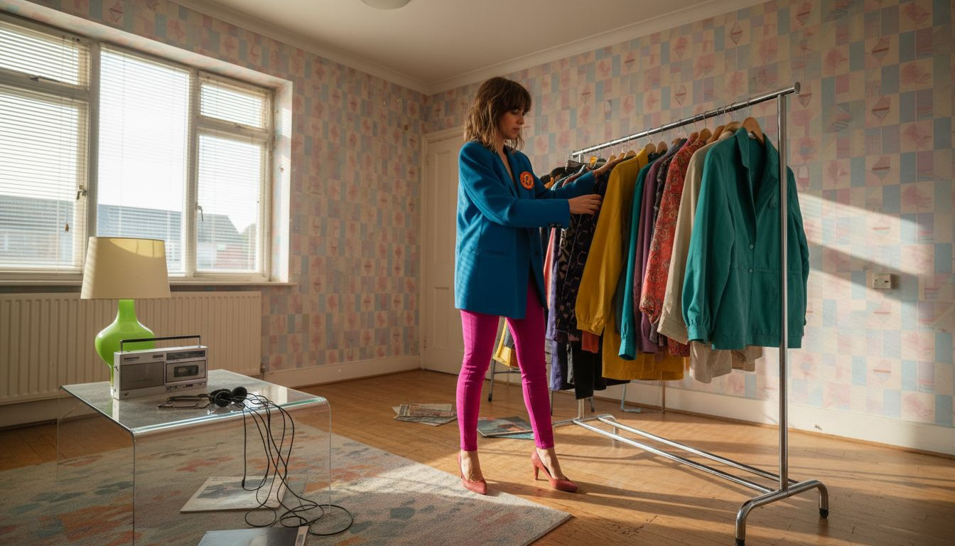
The colour story of the 80s was defined by its audacious approach to visual aesthetics. Unlike previous decades, this era embraced intense, saturated colours that challenged traditional design norms. Neon greens, electric blues, shocking pinks, and metallic yellows weren’t just colours they were statements about personal identity and cultural transformation.
Key colours like Caribbean Green, French Rose, and Violet-Blue represented more than mere pigments. They embodied the decade’s spirit of breaking boundaries and rejecting subtlety. Geometric patterns and colour blocking became visual languages that communicated energy, youth culture, and technological optimism.
Fashion designers and artists used these colours strategically. A bright teal blazer or magenta leggings weren’t just clothing items they were declarations of individuality. The palette reflected the era’s technological excitement, pop culture influences, and growing confidence in personal style expression.
Top Tip: When incorporating 80s colours, start with one bold piece and balance it with neutral tones to create a modern, wearable vintage look.
2. Mixing Neon Shades for Authentic Vintage Impact
Neon colours defined the 1980s visual landscape transforming everything from fashion to interior design. Mastering the art of mixing neon shades requires understanding their powerful visual language and strategic application in retro design contexts.
The key to authentic 80s neon styling is balance and intentionality. Electric blue, hot pink, neon green and bold purple were not just colours but statements of cultural rebellion. These vibrant hues represented technological excitement and youthful energy emblematic of the decade.
When incorporating neon shades think strategic accent pieces rather than overwhelming saturation. A neon yellow cushion against a neutral sofa or an electric blue picture frame can introduce vintage character without creating visual chaos. The goal is to capture the decade’s spirit through carefully curated colour moments.
Pairing neon colours with complementary tones creates visual harmony. Pastels and dark neutrals provide critical counterpoints that prevent the palette from becoming too aggressive. This approach allows you to embrace the 80s aesthetic while maintaining a sophisticated contemporary sensibility.
Top Tip: Start with one bold neon accent piece and build your vintage look gradually to avoid overwhelming your space or outfit.
3. Pairing Pastels with Bright Accents Effectively
The art of combining pastel colours with vibrant accents represents the quintessential 80s design philosophy of balanced visual drama. Mastering this technique requires understanding how vintage colour palettes create harmony and energy.
Pastels offer a gentle foundation that allows bold accents to truly shine. Soft blush pink or mint green provide an elegant backdrop for electric blue or hot magenta statement pieces. This approach creates visual interest without overwhelming the senses perfect for those wanting to capture the nuanced sophistication of vintage styling.
Strategic placement is crucial when mixing pastel and bright colours. Consider a mint green wall complemented by a vibrant orange armchair or a blush pink dress with a bold yellow belt. These combinations create dynamic visual narratives that speak to the playful spirit of 80s design while maintaining a sense of refined aesthetic balance.
The key is proportion and intentionality. Bright accents should function as punctuation marks in your overall colour composition not dominate the entire visual landscape. Aim for a 70 percent pastel to 30 percent bright accent ratio to achieve a harmonious vintage look.
Top Tip: Use white as a neutral bridging colour to help soften transitions between pastel bases and bright accent pieces.
4. Choosing Primary Colours for Retro Statement Pieces
The 1980s celebrated primary colours as powerful design statements that communicated boldness and individuality. Mastering retro colour palettes requires understanding how electric blue, vibrant orange, and bright pink can transform ordinary pieces into vintage statements.
Primary colours in retro design are not just about brightness but strategic visual impact. An electric blue leather jacket or a bright orange armchair can instantly communicate 80s aesthetic energy. These colours represent more than mere pigments they are cultural symbols of that era’s rebellious design philosophy.
To create authentic vintage looks, consider subtle tonal variations. Adding grey or brown can soften primary colours transforming them from garish to sophisticated. A burnt red instead of pure crimson or a muted mustard rather than canary yellow provides depth and nuanced vintage charm.
When selecting statement pieces focus on proportion and balance. A single primary colour element surrounded by neutral tones creates dramatic visual interest. Think a vibrant yellow belt against a white dress or cobalt blue shoes paired with a minimalist outfit.
Top Tip: Choose one primary colour as your statement piece and build your outfit or room design around its energetic presence.
5. Incorporating 80s Hues into Sustainable Fabric Choices
Sustainability meets vintage aesthetics through thoughtful fabric selection that captures the vibrant spirit of the 1980s. Sustainable fabric technologies have revolutionised how we approach colour and environmental responsibility.
Organic cotton and recycled materials now offer exciting opportunities to recreate iconic 80s hues while minimising ecological impact. Imagine a neon green linen blend shirt or a pastel pink recycled polyester jacket that speaks to both vintage style and modern environmental consciousness.
British textile innovations are leading the way in creating eco friendly fabrics that honour retro colour palettes. By choosing organic dyes and recycled fibres you can achieve electric blues, vibrant oranges and bold magentas without compromising environmental principles. These fabric choices support smaller carbon footprints and transparent production processes.
Practical implementation means seeking out local fabric producers who understand both sustainable manufacturing and vintage aesthetic principles. Look for certifications that guarantee ecological production methods while still delivering the bold colour expressions characteristic of 80s design.
Top Tip: Research textile manufacturers specialising in organic and recycled materials to find the most authentic vintage colour ranges that align with sustainable production practices.
6. Using the Colour Palette in Vintage Home Décor
The 1980s home décor palette represents a vibrant journey into bold design expression that transforms living spaces into nostalgic statements. Retro decorating principles celebrate colour as a fundamental storytelling element.
Authentic 80s home styling involves strategic colour blocking and pattern mixing. Electric blue accent walls paired with pastel pink furniture create dynamic visual conversations. Geometric patterns like chevrons and polka dots add layers of vintage character transforming ordinary rooms into time capsules of design innovation.
Incorporating metallic details and mid century modern furniture elements helps ground the vibrant colour palette. A mustard yellow armchair alongside chrome side tables or neon green cushions on a grey sofa can capture the decade’s unique design language. The key is balancing intense colours with neutral zones to prevent visual overwhelm.
Texture plays a crucial role in vintage colour implementation. Velvet upholstery in rich jewel tones silk throw cushions and glossy ceramic accessories can amplify the retro aesthetic while providing sensory depth to your colour choices.
Top Tip: Start with one bold colour element and gradually build your vintage palette by introducing complementary shades and textures.
7. Balancing Boldness and Subtlety for Modern Appeal
Modern vintage styling is an art of restraint and strategic expression particularly when channelling the exuberant 80s aesthetic. Modern 80s style demonstrates that authentic retro looks are about intelligent curation not overwhelming nostalgia.
The secret to contemporary vintage styling lies in strategic colour placement. Instead of drowning in neon, consider a single statement piece that speaks volumes. A bright magenta blazer paired with neutral trousers or an electric blue accessory against a minimalist outfit creates powerful visual impact without appearing costume like.
Texture and proportion play crucial roles in balancing bold 80s influences. Oversized silhouettes can be grounded with sleek, understated pieces. A voluminous blazer works beautifully when matched with streamlined trousers or a fitted turtleneck creating a dialogue between dramatic and refined design elements.
Think of vintage styling as a sophisticated conversation between eras. Each bold element should be thoughtfully introduced like a witty comment in an elegant discourse. The goal is to evoke the spirit of the 80s not recreate its entire visual vocabulary.
Top Tip: Choose one vibrant piece as your statement and build a refined neutral palette around it to achieve modern vintage sophistication.
Below is a comprehensive table summarising the key points on 1980s colour palettes as discussed in the article.
Aspect | Description | Key Takeaways |
Understanding Key Colours in the 80s Palette | The 1980s embraced vibrant colours symbolising optimism, rebellion, and self-expression. | Geometric patterns and neon colours became dominant design languages reflecting youthful energy and technological enthusiasm. |
Mixing Neon Shades for Authentic Vintage Impact | Neon colours were impactful design statements. | Pair neon elements with neutral tones to maintain balance and avoid overwhelming visuals. |
Pairing Pastels with Bright Accents Effectively | Combining softer tones with vibrant accents created balanced visual drama. | Pastel foundations enhanced the boldness of neon and bright accents for harmonious designs. |
Choosing Primary Colours for Retro Statement Pieces | Utilising primary colours like blue, orange, and pink made bold retro statements. | Combining with neutral backgrounds ensured the aesthetic retained sophistication. |
Incorporating 80s Hues into Sustainable Fabric Choices | Linking retro aesthetics with eco-friendly materials aligned style with environmental consciousness. | Using sustainable textiles achieved vivid colours while minimising ecological impact. |
Using the Colour Palette in Vintage Home Décor | 1980s colours transformed living spaces into dynamic retro environments. | Integrating textures such as velvet, and metallic accents solidified the aesthetic. |
Balancing Boldness and Subtlety for Modern Appeal | Strategic placement of bright pieces achieved impactful yet restrained visuals. | Minimalism paired with vibrant accents built modernised vintage looks. |
Bring the Vibrant Spirit of the 80s into Your Wardrobe and Home Today
Struggling to capture the authentic energy and bold colour play of the 1980s in your style or living space The challenge lies in balancing vivid neon hues, pastel accents, and primary colours without overwhelming your look or décor The article highlights how intentional colour blocking, strategic accents, and sustainable fabric choices create vintage charm with modern appeal At My Vintage, we understand your desire for individuality and timeless retro style that respects sustainability and authenticity
Explore our carefully curated collection of vintage clothing and retro homeware that effortlessly channels the 80s palette from electric blue blazers to neon accessories and pastel-infused décor pieces Every item embodies the decades’ fearless creativity while allowing you to build your vintage statement piece by piece Carry the true spirit of the 80s while shopping with confidence at My Vintage where quality, cultural significance, and eco-consciousness meet Start your journey to bold, sustainable, and authentic vintage style today
Frequently Asked Questions
How can I incorporate 80s colours into my wardrobe without going overboard?
You can start by selecting one bold 80s colour piece, like a bright blazer or statement accessory, and pair it with neutral clothing items. This approach helps balance the vibrancy while still making a retro statement.
What are some effective ways to use neon shades in home décor?
Utilise neon shades as accent pieces rather than dominating the space. For example, place a neon yellow cushion on a neutral sofa or hang an electric blue picture frame to introduce a pop of colour without overwhelming the room.
How do I mix pastel colours with bright accents for an 80s look?
Aim for a colour ratio of 70 percent pastel to 30 percent bright accents in your designs. For instance, consider painting a room in a soft mint green and adorning it with vibrant orange accessories to create a dynamic yet balanced aesthetic.
What types of statement pieces can effectively represent the 80s colour palette?
Choose bold primary colours for your statement pieces, such as an electric blue leather jacket or a bright orange chair. Surround these pieces with neutral decor to let them shine without competing for attention.
How can I ensure that my vintage style remains modern while using 80s colours?
Balance bold 80s elements with contemporary, understated pieces. For example, pair a bright magenta top with simple, neutral trousers to create a modern vintage look that captures the essence of the 80s without feeling outdated.
What role does texture play when using an 80s colour palette in design?
Texture adds depth to your colour choices and enhances the retro vibe. Incorporate varied materials like velvet, ceramics, and shiny surfaces to enrich your colour palette and create a more visually appealing environment.
Recommended


Comments