
1950s Colour Palette: Everything You Need to Know
- Nov 26, 2025
- 7 min read

Bold, joyful hues lit up British homes and wardrobes in the 1950s, signalling a new era of optimism and style. More than 100 official colours became available by the middle of the decade, a leap that shaped everything from interior design to fashion. The 1950s colour palette still inspires today, blending historical significance with visual delight for those fascinated by British creativity and the origins of mid-century aesthetics.
Table of Contents
Key Takeaways
Point | Details |
1950s Colour Palette | The decade’s colour palette was vibrant, characterised by bold hues and pastel shades that signified post-war optimism and consumer culture. |
Technological Influence | Innovations in colour reproduction allowed for richer colour experiences in everyday life, enhancing visual aesthetics in fashion and design. |
Cultural Shift in Fashion | The period saw a revolution in fashion and interior design, with daring colour combinations reflecting a break from wartime austerity. |
Misconceptions About Authenticity | Common myths about the 1950s suggest a monochromatic landscape, but the era was marked by a rich diversity of colours and designs, challenging these stereotypes. |
Defining the 1950s Colour Palette and Its Origins
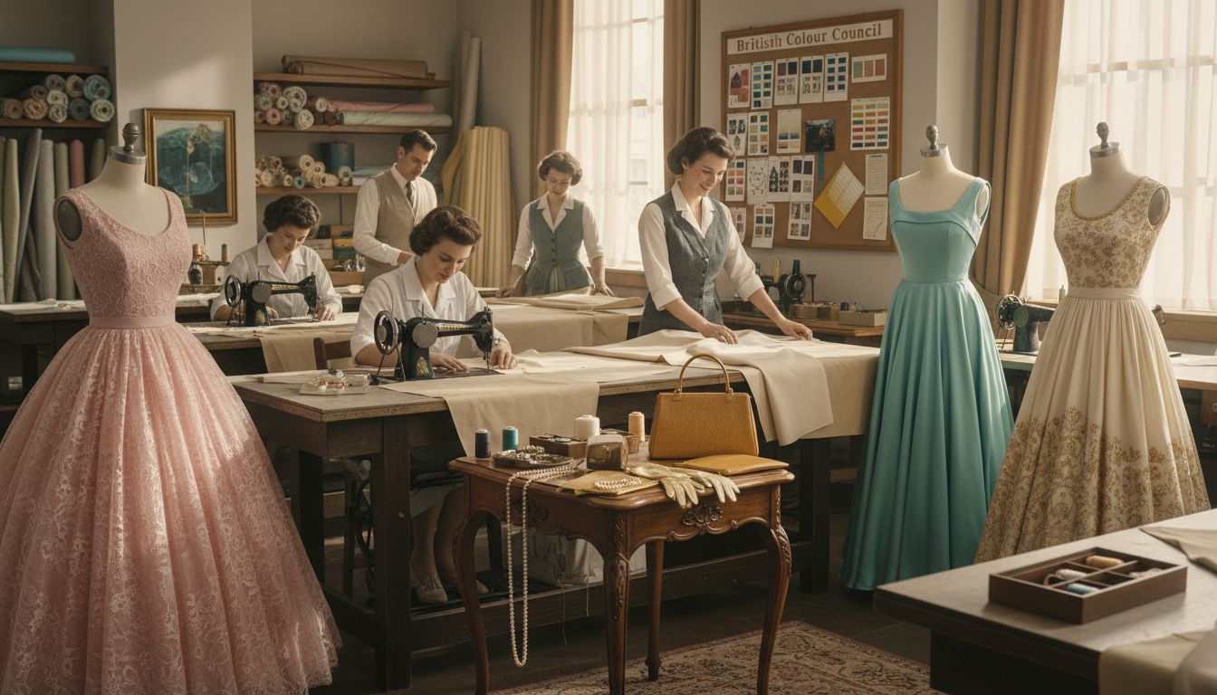
The 1950s colour palette emerged as a vibrant reflection of post-war optimism and technological advancement, transforming visual aesthetics across fashion, interior design, and photography. According to the British Colour Council, this era witnessed unprecedented standardisation of colour through comprehensive indexes like the ‘Dictionary of Colour Standards’ (1934) and ‘Dictionary of Colours for Interior Decoration’ (1949), which systematically catalogued and defined colour ranges for professional and domestic use.
The decade’s distinctive palette was characterised by bold, saturated hues that broke away from the muted tones of the wartime period. Designers and manufacturers embraced pastel shades like mint green, soft pink, powder blue, and butter yellow, alongside more vibrant colours such as cherry red, mustard yellow, and turquoise. These colours symbolised hope, prosperity, and the emerging consumer culture of the mid-20th century.
Photographic technologies like Dufaycolor, an early British additive colour photographic film process, also played a crucial role in shaping colour perception during this period. Active from the 1930s through the late 1950s, such technologies influenced how people visualised and interpreted colours, contributing to the era’s unique chromatic landscape. Technological innovations in colour reproduction meant that for the first time, everyday people could experience rich, nuanced colour representations in magazines, advertisements, and personal photographs.
Key characteristics of the 1950s colour palette included:
Optimistic, saturated colour combinations
Influence of post-war industrial design
Standardised colour ranges from professional bodies
Technological advancements in colour reproduction
For a deeper exploration of 1950s fashion and style, check out our complete guide to the 1950s fashion era.
Iconic Colour Schemes and Popular Hues
The 1950s colour palette was a vibrant tapestry of distinctive hues that transformed interior design, fashion, and cultural aesthetics. According to Gplan, UK homes embraced a revolutionary approach to colour, featuring pastel colour schemes with buttercup yellows, mint greens, and baby pinks that created a lighter, more joyful atmosphere compared to previous decades.
These iconic colour combinations were not just decorative choices but powerful statements of post-war optimism and economic recovery. Kitchens and living spaces became canvases for bold chromatic expressions, with complementary colour pairings like turquoise and coral, or mint green and soft pink dominating interior design. Appliances, furniture, and home textiles were deliberately manufactured in these cheerful, saturated hues, reflecting a collective desire to move beyond the austerity of wartime Britain.
Fashion mirrored these interior design trends, with clothing designers creating stunning ensembles that celebrated colour. Women’s dresses featured full skirts in pastel tones, often paired with coordinating accessories in contrasting yet harmonious shades. Men’s fashion also embraced this colourful revolution, with suits and casual wear incorporating unexpected colour combinations that challenged the more muted palettes of previous generations.
Key iconic colour combinations of the 1950s included:
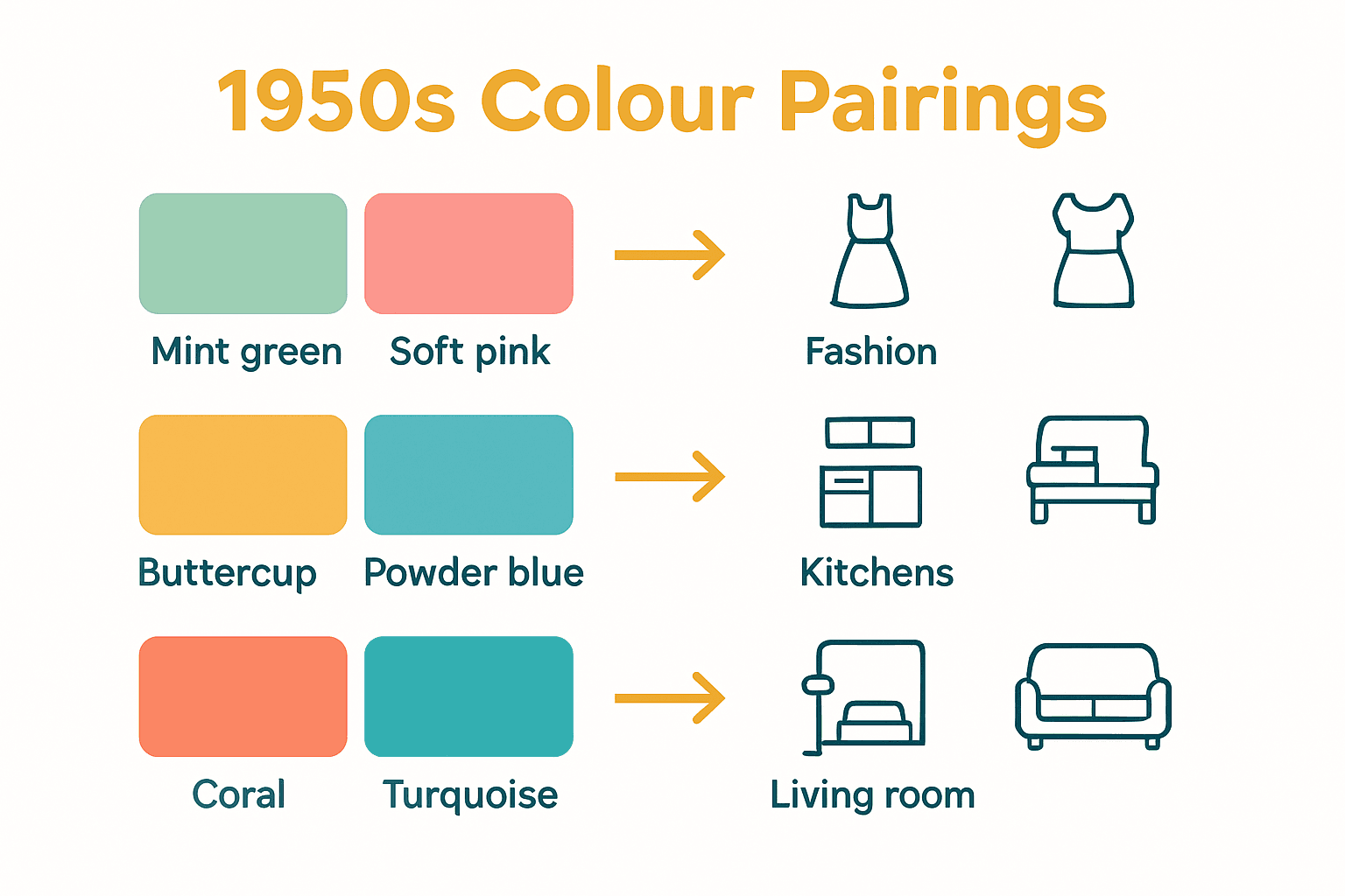
Mint green and soft pink
Buttercup yellow and powder blue
Coral and turquoise
Cherry red and cream
Mustard yellow and slate grey
For more insights into retro colour trends, explore our 70’s Retro Colour Palette guide to see how these vibrant 1950s influences continued to evolve.
Influences on Mid-Century Colour Choices
The mid-century colour landscape was dramatically shaped by technological innovations, urban development, and profound societal transformations. According to Cambridge, post-war urban planning and the emergence of new building materials offered unprecedented colour possibilities, with the British Standard paint range expanding to an impressive 101 colours by 1955, revolutionising architectural and design aesthetics.
Fashion and cultural movements played equally significant roles in colour selection during this era. The Peacock Revolution, as documented by research, encouraged men to embrace vibrant colours and intricate patterns, challenging traditional conservative dress codes. This societal shift reflected broader changes in artistic expression, social attitudes, and a collective desire to break free from the monochromatic constraints of the post-war period.
Industrial design and technological advancements further influenced colour choices. Manufacturing improvements allowed for more sophisticated colour production techniques, enabling designers to experiment with complex pigments and finishes. Electronics, automotive industries, and household appliance manufacturers began using colour as a strategic marketing tool, creating products that were not just functional but visually appealing and reflective of contemporary aesthetic sensibilities.
Key influences on mid-century colour choices included:
Technological innovations in colour production
Post-war urban regeneration
Fashion and cultural movements
Industrial design trends
Psychological desire for optimism and change
To explore more about vintage aesthetics and design principles, delve into our guide on what defines retro style.
Styling Vintage Fashion and Homeware Correctly
Authentically capturing the 1950s aesthetic requires a nuanced understanding of the era’s distinctive design principles and colour sensibilities. According to Gplan, creating a genuine mid-century look involves carefully selecting period-specific elements like pastel colour schemes featuring buttercup yellows, mint greens, and baby pinks, alongside furniture with light oak frames and traditional turned legs that epitomise the decade’s elegant simplicity.
In fashion, styling vintage 1950s looks demands attention to silhouette, proportion, and colour coordination. Women’s outfits typically featured structured full skirts, cinched waists, and coordinated accessories that complemented the overall colour palette. Men’s fashion embraced tailored suits with slim lapels, often incorporating bold colour combinations that reflected the era’s growing confidence and experimental spirit. Accessories played a crucial role, with carefully chosen gloves, scarves, and statement jewellery completing the quintessential 1950s ensemble.
Homeware styling requires a thoughtful approach that balances authenticity with contemporary sensibilities. Incorporate original mid-century pieces like atomic-inspired table lamps, kidney-shaped coffee tables, and ceramic decorative objects. Pay attention to texture and material, prioritising materials like fibreglass, moulded plywood, and formica that were quintessential to the period. Mixing original vintage pieces with carefully selected modern reproductions can create a sophisticated, lived-in aesthetic that honours the era’s design philosophy.
Key tips for authentic 1950s styling include:
Embrace pastel and saturated colour palettes
Focus on clean, geometric lines
Mix original vintage pieces with quality reproductions
Pay attention to proportions and silhouettes
Coordinate accessories meticulously
For more inspiration on creating the perfect vintage look, explore our guide on how to style vintage outfits like a pro.
Common Misconceptions and Authenticity Issues
One of the most pervasive myths about the 1950s is the perception of a uniformly monochromatic urban landscape. According to Cambridge, contrary to popular belief, post-war British towns were far from being predominantly grey and dull. In fact, the decade saw a remarkable expansion of colour choices, with the British Standard paint range for exteriors dramatically increasing to 101 distinct colours by 1955, challenging the narrative of a visually restrictive period.
Authenticity in vintage collecting presents its own set of challenges, particularly when referencing historical colour standards. British Colour Council colour codes, once the gold standard for design professionals, have been gradually supplanted by modern colour systems like Pantone and British Standards organisation references. This transition creates significant complexities for vintage enthusiasts attempting to precisely recreate or authenticate mid-century colour schemes, as original reference points become increasingly difficult to verify.
Furthermore, many contemporary vintage collectors fall prey to romanticised or inaccurate representations of 1950s aesthetics. Popular media often depicts the era through a narrow lens, emphasising either extreme nostalgia or stereotypical imagery that fails to capture the nuanced design innovations of the period. Authentic 1950s design was considerably more sophisticated and diverse than many simplified representations suggest, encompassing a wide range of design philosophies, regional variations, and technological innovations.
Common misconceptions about 1950s vintage include:
All 1950s design was uniformly pastel and conservative
Vintage pieces are always perfectly preserved
Colour standards remained static throughout the decade
Mid-century design was homogeneous across different regions
Vintage pieces are inherently more valuable than modern reproductions
To explore more about navigating vintage authenticity, check out our guide on how to accessorise vintage.
Discover Authentic 1950s Colours in Your Vintage Wardrobe and Homeware
Understanding the vibrant and optimistic 1950s colour palette is key to achieving an authentic mid-century style. If you find it challenging to capture the era’s unique mix of pastel and saturated hues or struggle with selecting pieces that truly represent the decade’s iconic colour schemes like mint green and soft pink or coral and turquoise, you’re not alone. These complexities around authenticity and colour standardisation can make styling vintage fashion and homeware feel overwhelming.

Explore our carefully curated collection at My Vintage for genuine vintage clothing and retro homeware that reflect the spirit and hues of the 1950s. Whether you want to embrace the classic pastel colour schemes or incorporate bold, cheerful accents into your interiors and outfits, we offer high-quality, original pieces and expert styling inspiration. Dive deeper into mid-century aesthetics with our comprehensive guides such as complete guide to the 1950s fashion era and learn how to style vintage outfits like a pro. Start your journey today and bring authentic 1950s style to your wardrobe and home before these timeless finds are gone.
Frequently Asked Questions
What are the main characteristics of the 1950s colour palette?
The 1950s colour palette is characterised by bold, saturated hues, pastel shades such as mint green and butter yellow, and vibrant colours like cherry red and turquoise. It reflects post-war optimism and the emerging consumer culture of the time.
How did technological advancements impact the 1950s colour palette?
Technological innovations in colour reproduction and manufacturing during the 1950s allowed for richer, nuanced colour representations in everyday life, influencing how people experienced colour in fashion, interior design, and photography.
What were some iconic colour combinations of the 1950s?
Iconic colour combinations from the 1950s include mint green and soft pink, buttercup yellow and powder blue, coral and turquoise, and cherry red paired with cream. These combinations were widely used in fashion and home design to create a lively and joyful atmosphere.
Why is authenticity important when collecting vintage 1950s items?
Authenticity is crucial in vintage collecting as many items may not reflect the true design and colour sensibilities of the 1950s. Misconceptions can lead collectors to overlook the sophisticated diversity within the era’s aesthetic, making an accurate understanding of colour standards and design principles essential.
Recommended