


Your Guide to the Perfect 50's Retro Colour Palette
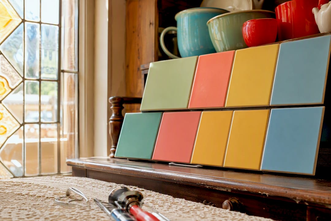
Three colour families define the authentic 50’s retro colour palette: atomic pastels, diner and roadside Americana, and quieter Scandinavian-influenced neutrals. Each one carries its own personality, and each pulls its weight in a different kind of project.
These colours weren’t a fashion whim. When Frigidaire launched its 1955 Colour Styling programme, it put mint fridges and coral cookers into thousands of ordinary kitchens almost overnight, and the palette went from designer’s sketchbook to national habit within a season.
Atomic pastels: mint, coral, butter, powder blue, best for interiors, upholstery, feminine fashion
Diner Americana: turquoise, cherry red, mustard, cream, chrome, best for kitchens, branding, statement accessories
Scandi/neutral: warm grey, soft cream, muted olive, best as a grounding base for either palette
The three signature 50’s retro colour palettes, with hex codes
Here at My Vintage, we’ve spent two decades handling original 1950s garments and homeware, so we know these colours in the fabric and the enamel, not just on a screen. That’s a useful thing to have on your side when you’re trying to build a retro 1950s colour palette that reads as genuine rather than costume-party bright.
Atomic Pastels
This is the palette most people picture when they think “1950s”: soft, milky, almost powdery tones that never quite reach full saturation. Pull one out on its own and it can look like any generic modern pastel. Use them as a set and they instantly read as mid-century.

Try the palette:
Powder Pink #E8B4B8
Mint #A8CDB5
Aqua #8FC9C5
Butter Yellow #F1D58A
Powder Blue #A8C5D1
That’s the chromatic logic ColorArchive’s guide to mid-century pastels points to when it insists these tones “read as a unit” and work best used together rather than dotted about in isolation.
Diner and Roadside Americana
Swap the softness for confidence. This palette is louder, higher-contrast, and built for signage, chrome trim, and the sort of red vinyl booth seating that never really went out of style.

Try the palette:
Cherry Red #B92D32
Turquoise #3EAAA5
Diner Cream #F3E3BC
Mustard Yellow #D9A52B
Chrome Grey #A7AAAB
The ColorArchive collection on retro Americana palettes treats this combination as a reconstruction of roadside visual culture: the diners, drive-ins, and forecourts that made cherry red and chrome a national shorthand for optimism on wheels.
Scandinavian and Natural Neutrals
Less shouted about, but every bit as period-correct. Post-war design absorbed a strong Scandinavian influence, and it shows up as warm greys, muted olive or khaki, and soft, buttery creams that never tip into stark white.

Try the palette:
Warm Cream #E8DDBD
Putty #B8AD98
Olive #858563
Warm Grey #9D978C
Teak Brown #806047
Use this strand as your foundation layer, whichever bolder family you’re building around. A room or outfit built entirely from pastels or entirely from diner reds tends to tip into pastiche. Ground it in warm neutral, and one or two accent hues suddenly do far more work.
How do you use a 1950s colour palette in real projects?
Rules of thumb first, because they’ll save you more time than any swatch book: anchor with a neutral or grounded base, reserve just one or two of your chosen pastels or Americana tones as the focal colour, and consider charcoal or deep chrome grey instead of pure white for contrast. Pure white is a modern default; 1950s design leaned on warmer, softer contrasts.
Finish matters more than most people expect. Glossy enamel and Formica surfaces bounce light and make pastel tones sing, which is exactly why 1950s kitchens gleamed the way they did. Matte fabrics do the opposite, muting the same hue considerably, so a coral in cotton poplin will read quite differently to the same coral in a lacquered laminate.
Three quick briefs to steal:
Accessory styling — pair a powder blue swing dress with a single cherry red accessory (bag or shoes) and leave everything else neutral.
Kitchen update — cream or soft grey cabinetry, mint or butter yellow on one wall or a run of tiles, chrome hardware throughout.
Diner or brand mood board — turquoise and cream as the base two, cherry red for signage or logo work, mustard as a rare third accent.
Before committing to a whole room or a full look, test properly. Order small swatches or paint samples, apply them to a modest area, then check how they behave under morning light, evening lamp light, and daylight bulbs. Colours that look gorgeous under a showroom spotlight can turn sickly under a kitchen strip light.
Pro Tip: Photograph your test swatch at three different times of day before you commit to a full wall or garment run. Mid-century colours were designed under incandescent bulbs, and daylight LEDs can shift a warm coral towards salmon pink.
Why do these colours feel authentically 1950s?

The short answer is manufacturing, not fashion. When appliance makers like Frigidaire rolled out colour styling as a marketing strategy in 1955, pastel refrigerators and cookers appeared in catalogues and showrooms across the country, and consumer culture followed. Colour stopped being a luxury detail and became a household expectation.
Three checks help you tell an authentic 1950s palette from a modern imitation:
Use the full system, not one isolated pastel; a single mint on its own looks contemporary, not vintage.
Keep saturation and lightness within the mid-range; anything too bright or too pale drifts into a different decade entirely.
Pair pastels or Americana tones with chrome or charcoal, not stark white.
Design authorities including Dunn-Edwards’s guidance on the 1955 colour palette come back to the same principle again and again: ground the space in soft, quiet neutrals, then let one or two cheerful pastels do the talking as focal accents.
Since 2004, My Vintage has sourced and sold genuine 1950s apparel and homeware, and supplied costume pieces for television and film productions, which means these swatches aren’t guesswork. They’re pulled from decades of handling the real fabric, enamel, and plastics.
How did mid-century modern design shape 1950s colour choices?
Mid-century modern design and the 1950s colour palette grew up together, and it’s difficult to separate cause from effect. The clean, uncluttered lines of mid-century furniture needed colour that wouldn’t compete with the shape of the piece itself. Softer pastels and warm neutrals did that job beautifully on a boomerang-shaped coffee table or a tapered-leg sideboard.

Mid-century design also prized honesty in materials, teak, moulded plywood, blond wood veneers, which pushed colour towards tones that would sit comfortably alongside natural timber. That’s part of why the Scandinavian-influenced neutral strand became such a strong companion to the brighter pastels rather than a competitor to them.
Playful geometry mattered too. Atomic-age motifs, boomerangs, starbursts, amoeba shapes, appeared constantly on textiles and laminates, and they were almost always rendered in the pastel or Americana palette rather than in muted, serious tones. Colour and shape reinforced each other: a mint green boomerang table felt optimistic in a way a beige one simply wouldn’t.
The result is a decade where furniture form and colour choice are genuinely inseparable, which is worth remembering if you’re building a project around furniture pieces rather than paint or fabric first.
How does the 1950s palette differ from the 40s and 60s?
Set a 50’s retro colour palette next to its neighbouring decades and the differences jump out immediately. The 1940s, shaped by wartime restriction and rationing, leaned on deeper, more subdued tones: forest green, burgundy, navy, mustard used sparingly rather than as a hero colour. Fabric shortages meant colour choices were practical first, decorative second.
The 1950s palette is the deliberate opposite: optimistic, consumer-driven, and unapologetically cheerful. Post-war prosperity and appliance marketing pushed colour towards softness and brightness rather than restraint, which is exactly why atomic pastels feel so distinct from anything the 1940s produced.
By the 1960s, the pendulum swung again, this time towards saturation and boldness. Op art and psychedelic influences pushed colour into acid greens, hot oranges, and deep purples, tones with far higher saturation than anything in the 1950s pastel family. Where the 1950s favoured medium lightness and gentle saturation, the 1960s wanted colour that vibrated.

Put simply: the 40s were muted by necessity, the 50s were soft by choice, and the 60s were loud by design. That progression is a genuinely useful shorthand if you’re trying to date a vintage piece by colour alone, or trying to avoid accidentally building a 60s-leaning palette when you actually wanted 1950s restraint.
How can you adapt a 1950s palette for a modern project?
You don’t need to recreate a museum piece to borrow convincingly from this era. The easiest route is restraint: pick one family, atomic pastel or diner Americana, and let it govern no more than two accent colours against a contemporary neutral base.
Contemporary matte paint finishes can work well if you accept that they’ll mute the pastel slightly compared with a period-correct gloss enamel, so it often helps to go one shade brighter than you think you need. If you want the punchier, glossier effect, look for satin or gloss finishes specifically rather than the flat finishes many modern interior ranges default to.
Mixing eras deliberately, rather than accidentally, tends to look more current. A single original 1950s accessory or piece of homeware against an otherwise modern room reads as considered styling rather than a themed set. For a wider look at how retro pieces sit inside contemporary spaces without tipping into pastiche, this piece on avoiding a dated look is a useful companion read.
Fashion translates the same principle differently: a single coral or mustard garment against an otherwise neutral, modern wardrobe borrows the era’s colour confidence without turning the whole outfit into fancy dress. For more styling inspiration that blends decades this way, our examples of vintage decor styles collection is worth a browse.
Bring the palette home with an original piece
Reading about a 1950s colour palette is one thing. Standing next to a piece that’s actually lived through the decade is another experience entirely, and it’s the fastest way to understand how these colours were meant to sit against real materials.
My Vintage has been sourcing genuine 1950s pieces since 2004, and our original atomic magazine rack is a lovely, compact way to bring authentic period colour and form into a modern room without committing to a full redecoration. It’s also the sort of small, characterful object that anchors a styling shoot if you’re working on a fashion or interiors project that needs a genuinely period prop rather than a reproduction.
Have a browse of our wider homeware collection if you’re building out a full 1950s-inspired scheme; every piece has already earned its patina honestly.
Sources
FAQ
What colours are in the 1950s vintage colour palette?
The core 1950s vintage palette combines atomic pastels (mint, coral, butter yellow, powder blue), diner Americana tones (turquoise, cherry red, mustard, cream, chrome), and a quieter Scandinavian-influenced strand of warm greys and soft creams.
What should I wear to a 50’s party?
Choose one signature colour from the atomic pastel family, such as powder blue or coral, and pair it with a single bold accent like cherry red accessories; full skirts, swing dresses, and neat separates all suit the period silhouette.
What were the most popular colours in the 1950s?
Pink, particularly the shade nicknamed First Lady Pink, and turquoise were two of the most visually dominant colours of the decade, alongside mint green and butter yellow in domestic settings.
Is one colour more iconic than the rest of the 1950s palette?
Pink is widely considered the single most emblematic colour of the era, appearing everywhere from appliances to fashion, though it was always used alongside turquoise, mint, and cream rather than on its own.
Recommended


Comments