
How the 1960s Pop Art Movement Transformed Fashion and Design
- Apr 16
- 8 min read

Most people think of pop art as something that belongs behind glass, in a hushed gallery, cordoned off from real life. But that view misses the point entirely. The 1960s pop art movement was never just about paintings on walls. It was a cultural explosion that rewired how we dressed, how we decorated our homes, and how we thought about beauty, value, and taste. From Mary Quant’s boutiques on the King’s Road to inflatable plastic chairs in suburban sitting rooms, pop art seeped into every corner of daily life. This guide traces that journey, and shows you why it still matters for vintage collectors and retro lovers today.
Point | Details |
Pop art’s cultural leap | The 1960s pop art movement extended its influence from high art into everyday fashion, interiors, and homeware. |
Style for everyone | Pop art made bold, colourful design accessible to all, shaping everything from magazine racks to mod dresses. |
Debate continues | Pop art is both celebrated for its accessibility and criticised for superficiality, keeping debate alive among collectors and critics. |
Collectors’ playground | Today’s vintage fans hunt for pop-inspired design, especially playful, bright objects from the 1960s. |
What Sparked the 1960s Pop Art Movement?
To understand pop art’s reach, you first need to know where it came from and what it was reacting against. By the early 1950s, the dominant force in the art world was Abstract Expressionism. Think Jackson Pollock’s tortured drips and Mark Rothko’s brooding colour fields. Serious, emotional, and deliberately difficult. A younger generation of artists found this exhausting and, frankly, a little self-important.
Pop Art emerged in the mid-1950s in Britain/9.06%3A_Pop_Art_(1950s-1960s)) with the Independent Group, a loose collective of artists, architects, and critics who met at the Institute of Contemporary Arts in London. They were fascinated by American mass culture: Hollywood films, glossy magazines, car advertisements, and comic books. That fascination became the raw material for a new kind of art.
The movement spread rapidly to the United States in the late 1950s and early 1960s, where artists like Andy Warhol, Roy Lichtenstein, and Jasper Johns took it in bold new directions. What united them all was a shared belief that the imagery of everyday commercial life was just as valid as any classical subject.
Here is what made pop art so distinctive from the start:
Mass media imagery: advertisements, packaging, comic strips, and newspaper photographs all became legitimate artistic subjects
Bright, unmodulated colour: no subtle blending or tonal gradations, just flat, vivid blocks of red, yellow, and blue
Repetition: the same image printed again and again, echoing factory production and consumer culture
Irony and wit: a playful, sometimes satirical attitude towards the objects and images being depicted
Accessibility: work that felt familiar, even fun, rather than intimidating
“Pop art was not about retreating from the world. It was about staring directly at it, soup cans and all, and declaring that this, too, is worthy of attention.”
This philosophy spread quickly through exhibitions, art magazines, and television coverage. Suddenly, art felt relevant to people who had never set foot in a gallery. And that democratising energy did not stay contained to canvas for long. You can see its spirit alive today in the way we approach vintage homeware trends, where bold pattern and colour are celebrated rather than hidden away.

Pop Art’s Signature Style: Bold, Bright, and Accessible
Now that we know how pop art emerged, let’s get to grips with what made its style so unique and so iconic. The visual language of pop art is immediately recognisable, even to people who could not name a single artist from the movement. That is precisely the point.
Pop art incorporated mass media, advertising, comics, and consumer goods/9.06%3A_Pop_Art_(1950s-1960s)) using bright colours and commercial printing techniques. Artists borrowed the look of mechanical reproduction, the Ben-Day dots of comic printing, the flat colour separations of billboard advertising, and the clean lines of product packaging.
Here are the key visual hallmarks:
Bold outlines: thick black lines borrowed from comic book illustration
Primary colours: red, yellow, and blue used without apology or subtlety
Repetition and seriality: the same motif reproduced in grids or sequences
Everyday subjects: soup cans, Coca-Cola bottles, Marilyn Monroe’s face, dollar bills
Text and speech bubbles: language pulled directly from advertising and comics
Artist | Signature motif | Technique |
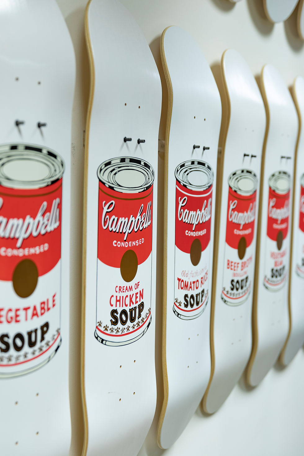
Andy Warhol | Campbell’s Soup Cans, Marilyn Monroe | Silkscreen printing |
Roy Lichtenstein | Comic strip panels, brushstroke paintings | Ben-Day dot printing |
Richard Hamilton | Collaged consumer goods | Photo montage |
Jasper Johns | Flags, targets, numbers | Encaustic and lithography |
What made this style so powerful was its deliberate rejection of exclusivity. You did not need an art education to recognise a soup can. That familiarity was the whole idea. Objects from daily life, the things you bought at the supermarket or saw in a magazine, were suddenly elevated to the status of art.
Pro Tip: If you are building a vintage collection with a pop art sensibility, look for pieces that feature bold geometric shapes, flat colour, and graphic pattern. A piece of mid-century atomic design carries exactly that visual energy.
For collectors, this style translates beautifully into homeware. Pieces from the 1960s that echo these visual principles are among the most sought-after in the vintage market. If you want inspiration for how to style them, our vintage homeware inspiration guide is a wonderful starting point.

From Galleries to the Home: Pop Art’s Impact on Design
Having explored the style, itis time to see how pop art leapt from the museum to our homes and everyday life. This is where the movement’s influence becomes genuinely thrilling for collectors.
Designers in the 1960s were watching the art world closely. They saw an opportunity to bring the same energy, the same boldness, the same sense of fun, into the objects people used every day. The result was a revolution in domestic design.
Pop furniture embraced bold colours, plastics, and inflatable pieces, reflecting the values of mass culture rather than traditional craftsmanship. Designers like Quistgaard, whose cutlery combined sculptural form with everyday function, and the creators of the Malitte seating system, a modular foam puzzle that could be rearranged at will, brought genuine artistic thinking to the objects in your kitchen and sitting room.
Here is how home design shifted before and after pop art’s influence:
Design element | Pre-1960s approach | Post-pop art approach |
Colour palette | Muted, natural tones | Vivid primaries and neons |
Materials | Wood, ceramic, glass | Plastics, vinyl, inflatable PVC |
Form | Traditional, functional | Sculptural, playful, experimental |
Cultural reference | Classical or craft traditions | Mass media and consumer culture |
The numbered steps below show how pop art thinking filtered into the home:
Colour first: Manufacturers began producing appliances and furniture in vivid reds, oranges, and yellows rather than beige or cream
New materials: Cheap, mouldable plastics allowed designers to create organic, sculptural forms that wood could never achieve
Graphic pattern: Wallpapers, fabrics, and ceramics adopted bold geometric and abstract prints
Disposability as design: Some pieces were deliberately temporary, inflatable chairs, paper dresses, celebrating the throwaway culture pop art both observed and gently mocked
Pro Tip: When hunting for authentic 1960s homeware, look for pieces in orange, lime green, or sunshine yellow. These colours are a reliable signal of the era. Our 1960s kitchenalia collection is a perfect place to start.

The cultural impact spread rapidly through exhibitions and media coverage, meaning these design ideas reached ordinary households surprisingly quickly. For ideas on how to incorporate these pieces into a modern bedroom, our vintage bedroom tips article is full of practical suggestions.
Pop Art in Fashion: Wearing Art on your Sleeve
Having filled our homes with pop, let’s step into how the same sensibility revolutionised what we wore. Fashion in the early 1960s was still largely shaped by the formal elegance of the post-war years. Then pop art arrived, and everything changed.
Designers like Mary Quant, working from her Bazaar boutique on the King’s Road in Chelsea, drew directly on pop art’s visual vocabulary. Flat colour, bold geometric shapes, and graphic pattern replaced the structured, ladylike silhouettes of the 1950s. The miniskirt was not just a hemline choice. It was a statement about youth, freedom, and a refusal to take fashion too seriously.
The key features of pop art fashion included:
Clashing, vivid colours: outfits that made no apology for being seen
Comic and graphic prints: literal pop art imagery transferred onto fabric
Target and op-art patterns: concentric circles and optical illusions on dresses and coats
Mod jewellery: oversized, geometric, and made from plastics and resins rather than precious metals
Playfulness over propriety: fashion as fun, not as status
Pop art’s use of mass media imagery and bright colours/9.06%3A_Pop_Art_(1950s-1960s)) translated directly into clothing that felt like wearing a piece of art. Designers like Yves Saint Laurent even produced dresses directly inspired by Mondrian’s grid paintings, making the connection between fine art and fashion completely explicit.
For vintage collectors today, these pieces are among the most joyful to seek out. A pair of pop art-inspired earrings from the 1960s carries all the optimism and boldness of the era in a single accessory. Or consider something like our holographic bead accessories, which capture that same spirit of colour and play.
Pro Tip: When styling a pop art-inspired outfit, resist the urge to tone things down. The whole point of this aesthetic is confidence. Pair a bold printed dress with simple shoes and let the pattern do the talking.
A Closer Look: Was Pop Art Simply Colourful, or Truly Radical?
With the groundwork laid, let us consider what pop art’s global popularity tells us and what most overviews get wrong. The standard story presents pop art as a cheerful, accessible movement that brought colour and fun to a grey world. That is true, as far as it goes. But it is also incomplete.
Pop art is celebrated for democratising art and blurring the boundary between high and low culture, but it is also criticised as superficial, lacking depth, and reinforcing consumerism without genuine political bite. Both views have merit, and that tension is actually what makes the movement so interesting.
Was Warhol celebrating or satirising Campbell’s Soup? Probably both, simultaneously. That ambiguity was deliberate. Pop art held a mirror up to consumer culture and refused to tell you whether to laugh or feel uncomfortable. For collectors, this is worth sitting with. The objects you find from this era carry that same complexity. A bright orange canister from a 1960s kitchen is not just decorative. It is a small piece of a much larger cultural argument about what we value and why.
We think pop art’s true legacy is not its colour palette or its famous faces. It is the question it posed: who decides what counts as serious art? That question still has no easy answer, and it is one we find ourselves returning to every time we curate a new collection.
Discover Your Own Pop Art Treasures
If all this pop vibrancy inspires you, here is how to bring a slice of the 1960s movement into your own life.

At My Vintage, we have been sourcing and curating authentic pieces from this extraordinary era since 2004. Whether you are after homeware that captures the era’s bold graphic energy or accessories that channel the spirit of mod fashion, we have something for you. Our authentic vintage atomic magazine rack is a perfect example of the sculptural, graphic design thinking that pop art inspired. And if you want to explore vintage homeware more broadly, our full collection spans decades of extraordinary design. Start building your own pop art story today.
Frequently Asked Questions
What is the most recognisable symbol of 1960s pop art?
Andy Warhol’s Campbell’s Soup Cans are widely recognised as the defining icon of the 1960s pop art movement, turning an everyday supermarket product into a celebrated work of art.
How did pop art change everyday home design?
Pop art introduced bold colours, plastics, and playful forms to furniture and accessories, making interiors far more vibrant and accessible than the muted, traditional styles that came before.
Why do some critics dismiss pop art as superficial?
Some critics argue pop art is superficial, lacking depth, and reinforcing consumerism without genuine political bite, focusing more on surface appearance than meaningful social commentary.
Are there any famous pop art designers for homeware?
Designers such as Quistgaard and Malitte creators used pop art characteristics to produce colourful, innovative homeware that brought artistic thinking directly into the domestic environment.
Recommended


Comments