


70's Retro Colour Palette: Key Styles
- Emma
- Nov 5, 2025
- 7 min read

Bold colours were more than just a passing trend in the 1970s. Over 60 percent of designers credit that decade’s warm earth tones and playful brights as shaping modern style choices. From avocado green sofas to mustard yellow kitchens, these unforgettable hues turned everyday spaces into vibrant reflections of cultural change. If you’re curious about what truly sets the 70s colour palette apart, get ready to see how each signature shade tells the story of an era fueled by creativity and individuality.
Key Points
Point | Details |
Cultural Expression | The 1970s colour palette reflects significant societal transformations, emphasising individuality and freedom in design. |
Signature Combinations | Typical colour pairings like burnt orange with mustard yellow showcase the era’s fearless approach to colour and design. |
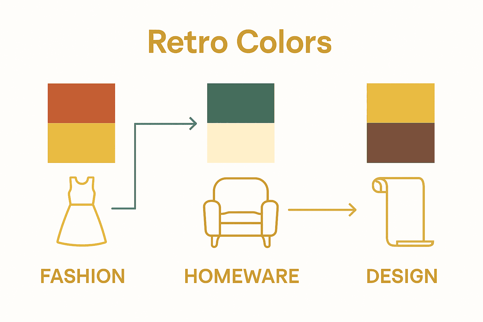
Cross-disciplinary Approach | The incorporation of 70s aesthetics spans fashion, homeware, and interior design, promoting cohesive visual expression across fields. |
Modern Integration | To utilise 70s colours today, focus on strategic accent pieces and balance bold hues with contemporary tones for a sophisticated look. |
Defining the 70’s Retro Colour Palette
The 1970s colour palette represents a vibrant, bold revolution in design and fashion that continues to captivate contemporary style enthusiasts. According to research from Northampton University, the decade’s colours were not merely aesthetic choices but powerful cultural expressions that reflected societal transformations.
The quintessential 70s colour palette emerged as a dynamic mix of warm, earthy tones and psychedelic hues that challenged traditional design conventions. Key colours included avocado green, harvest gold, burnt orange, rust brown, and mustard yellow - shades that symbolised a departure from the stark minimalism of previous decades. Contemporary fashion research suggests these colours represented more than visual trends; they were emblematic of a cultural shift towards more expressive, individualistic design.
These colours weren’t randomly selected but reflected deeper societal currents. Earthy tones connected to the emerging environmental consciousness, while bold, saturated colours spoke to the era’s experimental spirit. From interior design to fashion, the 70s colour palette represented a bold statement of freedom, creativity, and social transformation. Check out our guide on 70s style to explore how these colours defined an entire cultural moment.
Key characteristics of the 70s colour palette include:
Warm, saturated earth tones
High-contrast colour combinations
Psychological emphasis on individual expression
Blending of natural and synthetic colour influences
Rejection of previous decades’ more restrained colour schemes
Signature Shades and Typical Combinations
The 1970s colour palette was far more nuanced than simple bold hues, featuring intricate and sophisticated combinations that told a deeper visual story. According to research from UAL Research Online, the decade’s colour categorisation was remarkably complex, with distinct groups including naturals, reds, violets, blues, and greens that created layered and harmonious visual experiences.
Typical colour combinations embraced both complementary and unexpected pairings. Claret red might be paired with lilac, while bottle green could harmonise beautifully with cream. These combinations weren’t random but carefully curated to reflect the era’s innovative design philosophy.

NDA Research highlights how contemporary designers continue to draw inspiration from these sophisticated colour relationships, particularly through soft curves and large-scale patterns that capture the decade’s essence.
Beyond individual shades, the 70s colour palette was characterised by its willingness to experiment. Designers and fashionistas weren’t afraid to mix seemingly disparate colours like burnt orange with mustard yellow, or avocado green with rust brown. These bold combinations reflected the decade’s broader cultural ethos of breaking traditional rules and celebrating individual expression. Check out our guide on 70s style to understand how these colour choices were more than aesthetic - they were a statement.
Signature colour combinations of the 1970s included:
Here’s a summary of the signature 1970s colour combinations and their visual impact:
Combination | Typical Application | Visual/Emotional Effect |
Claret red & soft lilac | Fashion accessories Wallpaper | Sophisticated Expressive |
Bottle green & warm cream | Upholstery Clothing | Calm Natural warmth |
Burnt orange & mustard yellow | Cushions Patterned dresses | Energetic Vibrant Retro |
Lapis blue & crisp white | Curtains Shirts | Fresh Clean High contrast |
Earthy brown & vibrant turquoise | Rugs Decor items | Bold Grounded Eclectic |
Claret red and soft lilac
Bottle green and warm cream
Burnt orange with mustard yellow
Lapis blue and crisp white
Earthy brown with vibrant turquoise
Popular 70’s Patterns and Graphic Motifs
The 1970s were a golden era of graphic expression, where patterns became a powerful medium of cultural communication. According to NDA Research, the decade’s design landscape was characterised by large-scale, bold patterns that challenged conventional aesthetic norms, transforming everything from wallpaper to fashion into canvases of creative rebellion.
Psychedelic prints dominated the visual landscape, featuring intricate, swirling designs that seemed to dance across fabrics and surfaces. Geometric patterns with bold, angular shapes coexisted with organic, fluid motifs - reflecting the era’s complex social dynamics. Huddersfield University Research highlights how these patterns weren’t just decorative choices, but statements of cultural identity and personal freedom. From wallpapers to clothing, these graphic motifs represented a generation’s desire to break free from traditional design constraints.
The most iconic 70s patterns included paisley, op art, sunburst, and fractal-inspired designs that played with perception and movement. Wallpapers and textiles featured these mesmerising patterns in saturated colour palettes, creating immersive visual experiences. For enthusiasts looking to explore the depth of these design movements, our guide to vintage patterns offers a comprehensive exploration of this fascinating design era.
Most memorable 70s pattern categories included:
Psychedelic swirls and spirals
Geometric grid and angular designs
Nature-inspired organic shapes
Op art and optical illusion prints
Large-scale botanical and floral motifs
Applications in Fashion, Homeware, and Design
The 1970s aesthetic transcended individual design disciplines, creating a holistic approach to visual expression that seamlessly integrated fashion, homeware, and interior design. According to NDA Research, the decade’s design philosophy embraced large-scale colour block designs and repeat patterns that could be applied across multiple creative domains, from clothing to home decor.
In fashion, the 70s palette manifested through bell-bottom trousers, psychedelic print shirts, and flowing maxi dresses that captured the era’s free-spirited ethos. Homeware followed suit with bold wallpapers, chunky ceramic vases, and textured upholstery that mirrored the clothing’s adventurous spirit. Birmingham City University Research highlights how contemporary designers continue to draw inspiration from this versatile design approach, creating pieces that blend vintage aesthetics with modern sensibilities.
The era’s design principles were characterised by a fearless approach to mixing textures, patterns, and colors across different mediums. Macramé wall hangings might complement a geometric print dress, while shag carpets could echo the fluid lines of a paisley-print shirt. For those looking to incorporate these timeless design elements, our guide to vintage homewares offers expert insights into curating authentic 70s-inspired spaces.
Key cross-disciplinary design applications included:
Colour blocking across fashion and interior design
Matching textile patterns in clothing and home decor
Integrated design approaches for furniture and fashion
Psychedelic prints spanning multiple creative disciplines
Texture-rich materials used consistently across different design fields
Tips for Using 70’s Colours Today
Bringing 1970s colours into contemporary design requires a nuanced approach that balances nostalgic charm with modern sensibility. According to NDA Research, the key is to incorporate retro hues through strategic, curated choices that feel intentional rather than costume-like, focusing on candy-coloured palettes and soft, rounded shapes that evoke the era’s distinctive aesthetic.
Modern interpretation of 70s colours involves thoughtful integration rather than wholesale reproduction. Accent pieces are an excellent starting point - think a burnt orange throw cushion, an avocado green armchair, or mustard yellow ceramic vases that add vibrant historical character to neutral spaces. Arts University Research emphasises the importance of creating visual harmony by balancing bold vintage colours with contemporary neutral tones, ensuring the overall design feels sophisticated and intentional.
For those seeking to embrace the 70s palette more comprehensively, consider layering textures and implementing large-scale design elements that capture the decade’s experimental spirit. Rounded furniture, soft curves, and strategically placed vintage-inspired textiles can transform a space without overwhelming it. Those looking to dive deeper into vintage styling might want to explore our guide to 1970s fashion trends for additional inspiration.
Key strategies for incorporating 70s colours include:
Use bold colours as accent pieces
Balance vintage hues with neutral modern tones
Incorporate soft, rounded design elements
Layer textures inspired by 70s aesthetics
Select statement furniture in iconic 70s colours
Embrace the Vibrant Spirit of 70s Retro Colours Today
Discovering the rich and bold 70s retro colour palette can be inspiring yet challenging when trying to bring that authentic vibe into everyday style and home décor. The article highlights the key challenge of seamlessly integrating warm, saturated earth tones and psychedelic patterns without overwhelming your look or space. Many seek to balance nostalgic charm with modern subtlety while capturing the era’s expressive freedom and individuality.
At My Vintage, we understand how vital it is to create a curated, vintage aesthetic that truly reflects your unique style. Whether you’re drawn to iconic colour combinations like burnt orange with mustard yellow or crave statement pieces in avocado green and rust brown, our carefully selected vintage clothing and retro homeware offer the perfect solution.
Explore our authentic collection to infuse your wardrobe and interiors with the 70s’ unmistakable warmth and creativity without the risk of costume-like results. Start your journey into timeless style now by visiting My Vintage, where sustainable fashion meets cultural heritage. For expert inspiration on making these vibrant hues work today, delve into our detailed guide on 70s style and take the next step toward owning your personal retro statement.
Frequently Asked Questions
What are the key colours in the 70’s retro colour palette?
The key colours in the 70’s retro colour palette include avocado green, harvest gold, burnt orange, rust brown, and mustard yellow. These shades reflect a vibrant mix of earthy tones and psychedelic hues.
How can I incorporate 70’s colours into modern design?
To incorporate 70’s colours into modern design, consider using bold colours as accent pieces, balancing vintage hues with neutral modern tones, and layering textures with soft, rounded design elements.
What are some typical colour combinations from the 1970s?
Typical colour combinations from the 1970s include claret red with soft lilac, bottle green with warm cream, burnt orange paired with mustard yellow, lapis blue with crisp white, and earthy brown combined with vibrant turquoise.
What design elements characterised 70’s patterns and styles?
The 70’s patterns and styles were characterised by large-scale psychedelic prints, geometric shapes, and nature-inspired organic designs. These elements were prevalent in fashion, homeware, and interior design, reflecting a cultural shift towards more expressive and individualistic aesthetics.
Recommended