
Retro 60's Colour Palette: Inspiring Sustainable Style
- Jan 26
- 12 min read

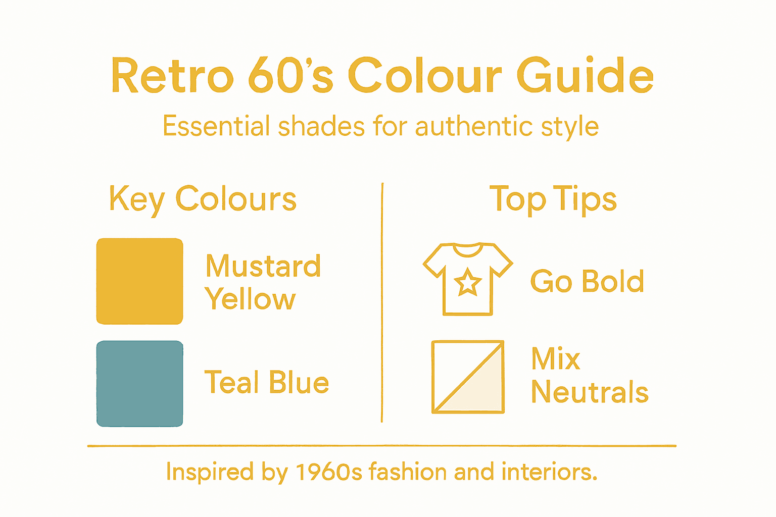
Swapping neutral tones for vibrant, statement shades is often the first step when curating a vintage-inspired space or wardrobe. For anyone drawn to classic British style with a bold twist, the retro 60’s colour palette delivers authenticity and unmatched character. The swinging sixties, marked by lively hues like mustard yellow, orange and gold, challenged tradition and championed self-expression. Discover how these iconic shades can bring both sustainability and genuine period character to your personal style and home decor.
Table of Contents
Key Takeaways
Point | Details |
Distinctive Palette | The retro 60’s colour palette is characterised by vibrant, bold hues that emphasise self-expression and individuality. |
Iconic Combinations | Successful colour pairings from the 60’s often involved contrasting warm and cool tones to create visual impact and energy. |
Fashion and Home Influence | The 60’s colour revolution profoundly influenced both fashion and interior design, promoting a sense of liberation through colour. |
Authenticity Matters | Genuine vintage pieces are crucial for an authentic retro aesthetic, as they possess depth and character that modern reproductions typically lack. |
Defining The Retro 60’s Colour Palette
The retro 60’s colour palette stands as one of the most distinctive and vibrant collections of hues in fashion and design history. Unlike the muted tones of previous decades, the 1960s embraced bold self-expression through colour in ways that fundamentally shifted how we think about interior design and personal style. This era wasn’t about subtlety or restraint—it was about breaking free from convention and celebrating individuality through rich, saturated colours that commanded attention.
The heart of the 60’s palette centres on a striking combination of warm and cool tones that create visual excitement together. Think mustard yellow, burnt orange, warm gold, and leafy greens paired with bold teals, electric blues, and deep purples. Vibrant colours like mustard yellow, orange and gold defined the swinging sixties, reflecting a time of cultural upheaval and artistic rebellion. Colour blocking became the signature technique of the decade, where contrasting hues sat directly beside each other without blending, creating what designers today would call “pop art” aesthetics. This approach wasn’t accidental—it drew directly from the Pop Art movement that dominated galleries and creative spaces, where artists like Andy Warhol celebrated bold, unapologetic colour combinations that modern sensibilities often found shocking.
What makes the 60’s palette particularly fascinating from a sustainability perspective is that Paint companies developed new colour ranges reflecting wallpaper and design trends of the period, showing how colour choices were deeply connected to broader cultural movements and artistic influences. The palette wasn’t randomly assembled; it evolved from Op Art principles, where colour perception itself became part of the artistic statement. Browns, burnt oranges, and olive greens provided earthy anchors, whilst peacock blues, shocking pinks, and lime greens offered the contrast that made interiors feel alive and forward-thinking. When you understand the philosophy behind these colour choices—that colour itself could express freedom, creativity, and individuality—you begin to see why incorporating genuine 60’s hues into your modern wardrobe or home becomes more than just aesthetic decoration. It becomes a statement about values and authenticity.
You can find authentic vintage pieces reflecting this genuine 60’s colour sensibility across our vintage collections, where each item carries the actual pigments and dye formulations of the era, rather than modern reproductions attempting to mimic them.
Pro tip: When selecting 60’s pieces for your collection, look for that characteristic saturated quality to the colours—genuine vintage dyes have a depth and richness that modern synthetic reproductions struggle to match, making authenticity immediately visible to the trained eye.

Iconic 60’s Shades And Combinations
The true magic of the 60’s colour palette lies not in individual shades alone, but in how they worked together to create visual impact. The decade pioneered an entirely new approach to colour pairing, moving away from the coordinated, harmonious schemes of earlier periods and embracing bold contrasts that made people stop and stare. These weren’t timid colour choices whispered in the background of a room or wardrobe—they were declarations of style, rebellion, and artistic vision.
The signature combinations that defined the era centred on striking warm and cool juxtapositions. Mellow yellows, mustard, orange, gold and green were used in colour blocking, often paired with vibrant teals, electric blues, and deep purples to create maximum visual contrast. Picture a dress featuring burnt orange with turquoise geometric blocks, or a living room wall in mustard yellow opposite a teal accent. These pairings weren’t accidents of taste—they reflected the psychedelic movement and the visual experiments happening in art galleries and on music festival stages. Shocking pink against lime green, gold against navy blue, peacock blue against cream—these combinations would have seemed garish just years before, yet they felt perfectly right in the 1960s context.
What made these combinations particularly effective was their relationship to Mod culture and youth subcultures that pioneered bold styles, where designers embraced high-impact colours and geometric patterns without apology. The colour blocking technique—applying flat, solid areas of contrasting colours next to each other—became the visual signature of the decade. Brown complemented with olive green, cream paired with shocking orange, navy blocking with mustard yellow—each combination created energy and movement. For sustainable fashion enthusiasts, understanding these authentic combinations matters enormously. When you source genuine vintage pieces in these original colour pairings, you’re wearing garments created with formulations and dye processes specific to that era, colours that have aged and mellowed in particular ways that modern reproductions simply cannot replicate.
The beauty of these iconic shades and combinations is their versatility in contemporary styling. A single vintage piece in a genuine 60’s colour acts as a colour statement piece in an otherwise neutral wardrobe. A burnt orange dress becomes your focal point, allowing neutrals and other supporting colours to recede. Alternatively, combining two authentic vintage 60’s pieces in complementary shades creates a cohesive, intentional look that feels both retro and remarkably modern.
Here’s a summary of iconic retro 60’s colour pairings and their visual impact on fashion and interiors:
Colour Pairing | Typical Usage | Visual Effect |
Mustard yellow & teal | Living room walls | Bold, energetic |
Burnt orange & turquoise | Geometric dresses | Eye-catching, playful |
Gold & navy blue | Coats and décor | Dramatic contrast |
Peacock blue & cream | Cushions, carpets | Elegant, vibrant |
Shocking pink & lime green | Curtains and accessories | Psychedelic, rebellious |
Pro tip: When building a 60’s inspired wardrobe, start with one bold vintage piece in an iconic shade, then add a second piece in a complementary colour from the era—this creates authentic visual impact without overwhelming your overall style.
Influence On Fashion And Home Decor
The 1960s didn’t simply introduce a new colour palette—it fundamentally rewired how people thought about personal expression through both fashion and living spaces. The decade’s bold approach to colour and design didn’t exist in isolation. Rather, it emerged from and reinforced massive social and cultural shifts that made vibrant, unapologetic style feel like an act of liberation. When you understand this context, incorporating authentic 60’s colours into your home and wardrobe becomes far more meaningful than simply following a trend.
Fashion became the primary vehicle for this colour revolution, with iconic figures like Mary Quant and Audrey Hepburn influencing global fashion trends that celebrated youth, individuality, and creative expression. Mini skirts in shocking yellows, shift dresses in electric blues, coats in burnt orange with bold geometric patterns—these weren’t subtle choices. They announced that a wearer was young, forward-thinking, and uninterested in conventional beauty standards. The colour palette became inseparable from the silhouettes themselves. Mary Quant’s geometric mini dresses didn’t just happen to be in bright colours; the colours were the entire point. They made youth visible, literally conspicuous, in streets and spaces that had previously enforced more muted aesthetics. This democratisation of bold style meant that anyone could access these colours through affordable clothing and fabrics, spreading the 60’s aesthetic far beyond high fashion.
The influence rippled directly into home décor, where bright, clashing shades and space age design reflected societal changes and cultural optimism. Living rooms exploded with colour combinations that would have horrified interior designers of earlier decades. Walls in mustard yellow with furniture in peacock blue, curtains in shocking pink against lime green carpets, cushions combining three or four contrasting 60’s shades in a single room. These weren’t accidents of taste—they were intentional statements about freedom from constraint. The colours themselves symbolised liberation, reflecting everything from the space race to the youth counterculture. Acrylic furniture, pop art influences, and clean-lined designs all worked together to create interiors that felt modern, optimistic, and thrillingly alive.
What matters for sustainable style enthusiasts is that retro style and vintage fashion continue shaping modern living in ways that trace directly back to this 60’s revolution. When you source genuine vintage pieces from the era—whether for your wardrobe or your home—you’re not just adopting colours. You’re engaging with an entire philosophy about self-expression, individuality, and refusing to blend in. The dyes, fabrics, and construction methods of authentic 60’s pieces carry that era’s energy in tangible ways that modern reproductions cannot replicate.
Pro tip: Mix one authentic vintage 60’s piece in a bold colour with contemporary neutral furniture or clothing to let the vintage item shine without overwhelming your space—this approach honours the era’s revolutionary spirit whilst keeping your overall aesthetic coherent.
Applying Retro Colours Authentically
Knowing the 60’s colour palette is one thing. Actually translating those vibrant shades into your wardrobe and living spaces authentically is quite another. The challenge lies in avoiding a costume-like appearance or something that feels frozen in time rather than genuinely retro. The secret isn’t simply grabbing the brightest mustard yellow you can find and hoping for the best. Instead, authentic application requires understanding how genuine 60’s colours age, how they interact with modern fabrics and materials, and how to balance nostalgic hues with pieces that make sense in your contemporary life.
The most important principle is working with authentic vintage pieces whenever possible. Incorporating retro colours requires balancing nostalgic hues with modern silhouettes, textures and accessories to create looks that feel both vintage and current rather than overly dated. When you source a genuine 60’s dress in burnt orange or a vintage home décor piece in mustard yellow, you’re already working with colours that have naturally aged and mellowed over decades. These authentic pieces carry depth that modern reproductions simply cannot replicate. The dyes have settled, any fading has occurred in period-appropriate ways, and the colours have acquired character through time. A genuinely vintage piece in a 60’s colour acts as an anchor point in your wardrobe or home—something that immediately signals authenticity to anyone who understands retro style.
For those building a 60’s inspired aesthetic without relying entirely on vintage finds, the approach requires intention. Rather than pairing bright 60’s colours with equally modern accessories, create visual bridges to contemporary style. A vintage or vintage-inspired piece in shocking pink works beautifully with modern neutral basics and contemporary jewellery, allowing the retro colour to shine without the overall effect feeling costumey. In home décor, testing colours on a sample sheet helps achieve the right vintage look before committing to large purchases. Paint a small section of wall in your chosen 60’s shade, then observe how it appears in different lighting throughout the day. What seems like the perfect mustard yellow at midday might feel quite different in evening light. This practical testing ensures you achieve colours that feel authentically retro rather than aggressively garish.
The sustainability advantage of this approach becomes clear when you understand authenticity. Choosing retro interior design through careful curation of genuine vintage pieces means you’re extending the life of existing garments and home goods rather than purchasing new items. Each authentic 60’s piece you acquire already has decades of environmental impact behind it—its carbon footprint is essentially fixed. This makes sustainability and authenticity perfectly aligned goals in 60’s colour styling.
Pro tip: Start with one genuine vintage 60’s piece in a bold colour, then build around it with neutrals and contemporary pieces rather than trying to create an entire 60’s colour-coordinated look at once—this approach feels modern whilst honouring the era’s authentic aesthetic.
Common Mistakes To Avoid
Building an authentic 60’s colour palette is easier than you might think, but getting it genuinely right requires awareness of pitfalls that many enthusiasts stumble into. The most frequent mistakes stem from oversimplification, mismatched expectations, and not taking time to understand what makes the era’s colours work. When you know what to avoid, you’ll immediately find yourself making more confident, more authentic choices.
The biggest mistake is treating the 60’s palette as one monolithic thing rather than understanding its nuance and evolution throughout the decade. Not all 60’s colours carry equal weight or importance. Bright yellows and electric blues dominated the early to mid-60’s, whilst by the late 60’s, earthy browns, olive greens, and deeper burnt oranges began gaining ground. Mixing early and late 60’s colours indiscriminately creates visual confusion rather than coherence. Neglecting historical accuracy and underestimating the emotional impact of colour combinations leads to palettes that look more costume than curated. The 60’s wasn’t simply “bright colours everywhere”—it was about bold contrast with purpose. A shocking pink worked because it sat opposite specific complementary shades, not because pink alone was revolutionary. When you grab random bright colours without understanding their relationships, you create visual noise instead of intentional design.
Another common error involves relying entirely on reproduction pieces rather than mixing in genuine vintage. Modern manufacturers attempting to recreate 60’s colours often miss the subtle saturation and depth that authentic dyes achieved. A reproduction mustard yellow typically feels flatter, more synthetic, than a genuine 60’s piece. The emotional impact changes when your eye registers that difference, even if you can’t articulate why something feels off. Many people make the mistake of over-saturating their entire wardrobe or home with multiple bold 60’s colours simultaneously, then wondering why everything feels chaotic rather than cohesive. The era’s designers understood restraint. A single bold 60’s colour, balanced with neutrals or complementary shades from the period, creates impact. Everything bright simultaneously creates fatigue.
Testing colour choices in different lighting conditions matters enormously, yet many skip this step entirely. That stunning mustard yellow looks entirely different in your home’s evening lighting than it did in the shop. Paint samples on actual walls, place fabric swatches in genuine daylight and lamplight, and live with potential choices before committing. What appears perfect under fluorescent shop lighting may feel completely wrong in natural daylight. Finally, avoid assuming that any vintage item is automatically correct simply because it’s old. Pieces from the 1970s or 1980s carry different colour sensibilities than genuine 60’s items. Understanding era-appropriate hues ensures your collection tells a cohesive story rather than becoming a random assortment of dated clothing and décor.
To help avoid common pitfalls when creating a 60’s inspired palette, see this comparison of authentic vs. reproduction choices:
Aspect | Genuine Vintage Piece | Modern Reproduction |
Colour Depth | Rich, aged saturation | Flat, sometimes synthetic |
Emotional Resonance | Evokes era authenticity | Often lacks historical nuance |
Sustainability Impact | Extends life of original garment | Adds to new production footprint |
Visual Coherence | Harmonises period-appropriate shades | Risks colour confusion |
Pro tip: Before purchasing any piece claiming to be 60’s-inspired, ask yourself whether it could authentically exist in the era—if the colour combination feels like something a 1960s designer would have created with the knowledge and materials of that time, you’re likely on the right track.
Embrace Authentic 60’s Colour with Sustainable Vintage Style
Unlock the true spirit of the 1960s colour revolution without compromising your commitment to sustainability. The article highlights the challenge of harnessing authentic 60’s shades and combinations while avoiding costume-like or synthetic reproductions. If you crave that rich depth of genuine vintage dyes and the cultural essence behind bold mustard yellows, burnt oranges, and electric blues, it is crucial to choose pieces that carry the era’s originality and environmental responsibility.
At My Vintage, you can explore a curated collection of authentic vintage clothing and retro homeware that brings these iconic 60’s palettes alive. Each carefully sourced item reflects the true colours and craftsmanship of the era that faded gracefully over time. Whether you want to make a bold fashion statement or energise your home décor with vibrant retro flair, our collection supports your goal for sustainable style without losing authenticity. Visit our landing page to start building a timeless and eco-conscious 60’s inspired wardrobe or interior. Discover genuine vintage pieces that embody individuality and a meaningful connection to cultural history today.
Frequently Asked Questions
What are the key characteristics of the retro 60’s colour palette?
The retro 60’s colour palette is known for its vibrant and bold hues, such as mustard yellow, burnt orange, and deep purples, often combined in striking contrasts through techniques like colour blocking. These colours reflect a time of artistic rebellion and self-expression.
How can I incorporate retro 60’s colours into my wardrobe?
To authentically incorporate retro 60’s colours, start with one vintage piece in a bold colour, such as a burnt orange dress. Pair it with neutrals or a complementary vintage piece for a cohesive, intentional look that honours the era’s aesthetic.
Why is it important to choose authentic vintage pieces for a retro 60’s style?
Authentic vintage pieces carry unique dye formulations and colour depth that modern reproductions often lack. They reflect the true essence of the 60’s style, making it easier to achieve the authentic look and feel associated with that vibrant decade.
What should I avoid when creating a 60’s inspired colour palette?
Avoid mixing colour choices from different periods indiscriminately, as this can lead to visual confusion. Also, be cautious of oversaturating your space or wardrobe with too many bold colours at once; instead, aim for balance with neutrals or complementary shades.
Recommended

Comments