


1950s Colour Scheme: How to Get the Look

A 1950s colour scheme is defined by a confident mix of soft pastels and bold retro accents, applied with intention to create spaces that feel nostalgic yet fresh. Think mint green, butter yellow, and robin’s egg blue sitting alongside punchy turquoise, coral, and burnt orange. These are the colours of post-war optimism, and they translate beautifully into modern interiors when handled with care. At My Vintage, we have a genuine passion for this era, and we know that getting the balance right makes all the difference between a room that sings and one that feels like a fancy dress costume.
What are the signature colours of a 1950s colour scheme?

The 1950s interior design palette divides neatly into two families: soft pastels and bold primaries. Both played distinct roles in period rooms, and understanding that distinction is the first step to recreating the look authentically.
The pastel family includes:
Mint green — a cool, clean shade used on kitchen walls, tiles, and appliances
Butter yellow — warm and cheerful, popular in dining rooms and kitchens
Robin’s egg blue — a delicate, airy tone that appeared on bathroom fixtures and bedroom walls
Salmon pink — soft and feminine, used in bathrooms and boudoir-style bedrooms
Powder blue — a lighter cousin of robin’s egg, often paired with white woodwork
The bold accent family includes:
Turquoise — the decade’s most iconic statement colour, used on sofas, curtains, and feature walls
Chartreuse — a sharp yellow-green that added energy to living spaces
Coral — a warmer, more saturated take on salmon, used as a focal point
Burnt orange — grounded and earthy, often appearing in rugs and upholstery
Bold primaries like turquoise and coral create clean focal points against neutral backgrounds, balancing the softer pastels that dominated kitchens and bathrooms. This contrast is what gives 1950s interiors their visual energy. Pastels kept everyday spaces calm and practical, while bold accents gave living rooms and lounges their personality.
One important note on colour quality: the most successful retro palettes use clean, vibrant versions of these hues. A sharp ochre reads as period-perfect. A dull harvest gold reads as tired. The distinction matters more than you might expect.
How to Apply a 1950s Colour Scheme Using the 60-30-10 Rule

Knowing the colours is one thing. Knowing how to distribute them is another. The 60-30-10 rule is the most reliable framework for achieving a balanced vintage-inspired interior without overwhelming the space.
Here is how it works in practice:
60% dominant neutral. This is your walls, large furniture, and flooring. White, off-white, and warm grey all work beautifully. Walls in 1950s contemporary-style rooms were frequently painted white, with colour concentrated in furnishings and rugs. That technique preserves spaciousness and lets your accent colours breathe.
30% secondary colour. This is your main retro hue, applied through a sofa, curtains, a painted dresser, or a large rug. Choose one colour from the pastel or bold family and commit to it. Mint green curtains with a matching painted sideboard, for example, create a cohesive secondary layer without tipping into excess.
10% bold accent. This is where you bring in the punchy retro tones. A pair of turquoise cushions, a coral lamp, or a chartreuse vase. These small doses of intensity are what make the room feel authentically 1950s.
The ceiling is often overlooked, but it matters enormously. Keep it bright white or a very pale neutral. Darker ceiling treatments visually shrink a room, which works against the airy, optimistic spirit of the era.
Pro Tip: Pair your 30% secondary colour with brushed brass or chrome hardware. Mid-century modern interiors leaned heavily on metallic accents, and these finishes tie the look together without adding another colour to manage.
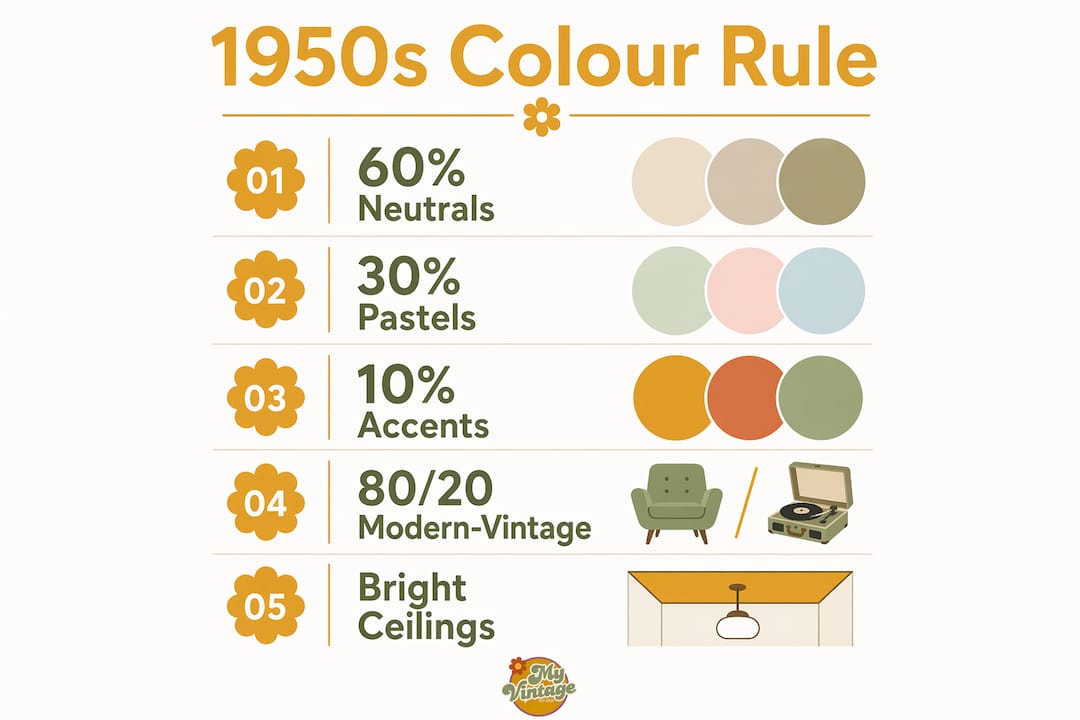
The 80/20 rule works alongside the 60-30-10 framework. Using 80% modern or neutral for large furniture and architectural finishes, then adding 20% vintage retro accents, prevents the kitschy theme-room effect that puts many people off retro decorating. The goal is a room that feels informed by the 1950s, not trapped in them.
Common Mistakes When Using 1950s Colours and How to Avoid Them

The most common mistake is over-theming. A room filled wall to wall with pastel pink, poodle prints, and jukebox imagery stops being a home and starts being a set. Combining retro and modern elements thoughtfully allows 1950s colours to feel timeless rather than theatrical.
Here are the pitfalls worth watching for:
Muddy or dull shades. Avoid colours that have greyed or browned with age. Choose cleaner, vibrant shades like a sharp ochre rather than a flat harvest gold. The difference is subtle on a paint chip but dramatic on a wall.
Too many accent colours at once. Pick one bold accent and one pastel secondary. Stacking coral, turquoise, and chartreuse in the same room creates visual noise rather than vintage charm.
Ignoring the ceiling. A white ceiling keeps the room open and light. A coloured or dark ceiling in a small room will feel oppressive, regardless of how well the walls are handled.
Mismatched metals. Mixing chrome, brass, and copper in the same room fragments the look. Choose one metallic finish and apply it consistently across light fittings, handles, and taps.
All vintage, no contrast. A room furnished entirely with period pieces can feel like a museum. Introduce a contemporary sofa or a simple modern shelf to ground the space and make the vintage elements pop.
Pro Tip: If you are unsure whether a retro colour feels fresh or dated, hold a paint swatch against a piece of white card in natural daylight. Clean, vibrant hues will glow. Muddy ones will look flat.
The retro interior design principle of restraint applies directly here. Less is genuinely more when working with bold vintage palettes.
Room by Room: Where to Use 1950s Colours in Your Home
Different rooms suit different parts of the 1950s palette. Applying the right colours in the right spaces is what makes a vintage-inspired home feel considered rather than accidental.
Kitchens and Bathrooms

Pastels like robin’s egg blue and salmon pink appeared frequently in 1950s kitchens and bathrooms, applied to appliances, sinks, tubs, and tiles. You can recreate this authentically today with:
Pastel-painted lower cabinets paired with white upper cabinets
Ceramic tile backsplashes in classic 4.25-inch square format, laid in a simple grid pattern
Pastel-coloured accessories such as soap dispensers, canisters, and tea towels
A mint or butter yellow feature wall behind open shelving
Keep the rest of the kitchen white or very pale grey. The pastel elements will read as intentional rather than overwhelming.
Living Rooms and Lounges
The living room is where bold accents belong. A turquoise sofa against white walls is a classic 1950s statement. Alternatively, use a bold accent wall in coral or chartreuse behind a neutral sofa arrangement. Curtains in a geometric or abstract print, using the era’s signature colours, add pattern without competing with the furniture.
Pair these with a mid-century modern sideboard in walnut or teak, and the room immediately reads as period-informed. For accent wall inspiration using bold geometric treatments, art deco media walls offer a useful reference point for structured, era-appropriate wall design.
Bedrooms

Bedrooms suit the softer end of the palette. Powder blue, butter yellow, and pale coral all work well as wall colours here. Keep bedding and curtains in complementary neutrals, then introduce the era through accessories: a painted bedside table, a ceramic lamp base, or a framed vintage print.
The 1950s colour palette works particularly well in bedrooms because the pastel tones are naturally calming. Soft pastels create calming, nostalgic spaces that appeal to anyone seeking comfort alongside vintage charm.
How to Source Vintage-Style Products that Bring the Palette to Life

Finding the right pieces is as important as choosing the right colours. The palette only works when the objects in the room support it.
A few practical approaches:
Prioritise accent pieces over large furniture. A vintage ceramic vase in robin’s egg blue or a set of coral cushions delivers colour impact without commitment. Large retro furniture pieces can overpower a room if not balanced carefully.
Look for period-appropriate materials. Formica-style laminates, ceramic tiles, and moulded plastic all appeared in authentic 1950s interiors. These materials carry the era’s character in a way that fabric alone cannot.
Mix original vintage with quality reproductions. Original pieces carry genuine character, but well-made reproductions in the correct colours are a practical alternative. The key is quality. Cheap reproductions in dull or inaccurate colours undermine the whole scheme.
Use rugs to anchor the palette. A rug in a bold retro colour grounds the room and ties disparate elements together. A turquoise or coral rug on a pale floor is one of the most effective single moves in 1950s-inspired decorating.
Apply the 80/20 rule to sourcing. Buy most of your furniture new or in a neutral contemporary style, then source the 20% vintage accent pieces with care. This keeps the room liveable and avoids the theme-park effect.

Using bold colours as controlled accents prevents rooms from feeling chaotic, which is the most common issue when people first attempt retro styling. Restraint in sourcing mirrors restraint in colour application.
Key Takeaways
A 1950s colour scheme works best when pastels form the backdrop, bold accents provide the focal points, and the 60-30-10 rule keeps the distribution intentional throughout every room.
Point | Details |
Use the 60-30-10 rule | Allocate 60% neutral, 30% pastel secondary, and 10% bold retro accent for a balanced result. |
Choose clean, vibrant hues | Avoid muddy or greyed shades; sharp ochre and true turquoise read as period-authentic. |
Keep ceilings white | A bright white ceiling preserves the airy, optimistic spirit of 1950s interiors. |
Apply the 80/20 furniture rule | Use 80% modern or neutral furniture and 20% vintage accent pieces to avoid over-theming. |
Match materials to the era | Ceramic tiles, Formica-style laminates, and moulded plastics reinforce the palette authentically. |
Vintage homeware that brings the 1950s to life
At My Vintage, we have been curating authentic vintage and retro homeware since 2004, and the 1950s remains one of our most loved eras. Whether you are after a single statement piece or building an entire room scheme, our collection reflects the pastels and bold accents that defined the decade.
Our original 1950s vintage atomic magazine rack is a perfect example of the era’s design sensibility: clean lines, period-perfect form, and the kind of authentic character that reproductions rarely match. Pieces like this do the heavy lifting in a retro colour scheme, anchoring the look without requiring you to redecorate an entire room. Browse our full vintage homeware collection and find the accent pieces that make your space genuinely yours.
Frequently Asked Questions
What colours define a 1950s colour scheme?
A 1950s colour scheme combines soft pastels such as mint green, butter yellow, and robin’s egg blue with bold accents including turquoise, coral, and burnt orange. Pastels dominated kitchens and bathrooms, while bold hues appeared as statement accents in living spaces.
How do I use the 60-30-10 rule for 1950s interiors?
Apply 60% neutral tones to walls and large furniture, 30% to a secondary retro colour through curtains or a sofa, and 10% to a bold accent through cushions or accessories. This distribution keeps the look intentional and prevents the space from feeling overwhelming.
How do I stop my 1950s-inspired room looking like a theme room?
Follow the 80/20 rule: use 80% modern or neutral furniture and add 20% vintage retro accents. Limit bold retro colours to accent pieces rather than applying them to every surface, and choose clean, vibrant shades rather than dull or muddy tones.
Which rooms suit 1950s pastel colours best?
Kitchens, bathrooms, and bedrooms suit the softer pastel tones such as robin’s egg blue, salmon pink, and powder blue. Living rooms and lounges are better suited to the bold accent colours like turquoise and coral, applied as feature walls or statement furniture.
Can I mix 1950s colours with modern interiors?
Yes. Pairing vintage pastels and bold retro accents with contemporary furniture and finishes is the most effective approach. Modern pieces provide the neutral backdrop that allows 1950s colours to feel fresh rather than dated.
Recommended


Comments