
Mastering the 1980s Colour Palette
- Mar 8
- 12 min read

Recreating authentic 1980s colour schemes challenges even dedicated vintage enthusiasts. The decade’s vibrant aesthetic spans neon brights, soft pastels, and metallic accents, each serving distinct roles in fashion and interior design. Understanding which shades define genuine 80s style, how to pair them effectively, and identifying authentic vintage pieces transforms chaotic experimentation into confident styling choices that honour this iconic era’s visual language.
Table of Contents
Key takeaways
Point | Details |
Colour groups | The 1980s palette divides into neon, pastel, and metallic categories, each with specific cultural applications and styling rules. |
Contrast principles | Pairing neon with black or white amplifies vibrancy whilst avoiding visual chaos, defining the decade’s bold aesthetic. |
Authenticity markers | Genuine 80s textiles show characteristic fading patterns and dye saturation that distinguish them from modern reproductions. |
Situational styling | Neon suits nightlife and activewear, whilst pastels work for casual and workplace vintage looks. |
Design influences | Memphis Group aesthetics inform authentic colour application in both fashion and home décor. |
Selection Criteria for Choosing 1980s Colours
Selecting authentic 80s colours requires evaluating vibrancy, context, and material properties. The decade favoured high saturation levels that modern reproductions often miss. Start by assessing whether your colour choice reflects genuine 80s intensity or watered-down contemporary interpretations.
Your application context shapes colour selection significantly. Fashion demands differ from interior décor. Nightlife outfits embrace maximal neon vibrancy, whilst workplace vintage styling benefits from subtler pastel tones that nod to the era without overwhelming professional settings.
Fabric type determines colour authenticity and longevity. Synthetics like polyester held neon dyes brilliantly, whilst cotton-blend pastels aged distinctively. Authenticity in 1980s vintage colour palettes can often be identified by fabric type and dye saturation; genuine 80s textiles show characteristic colourfastness fading patterns distinctive from modern reproductions.
Occasion appropriateness prevents style missteps. Consider where you’ll wear or display your vintage pieces. A hot pink blazer works beautifully for themed events but might clash with everyday errands. Match colour intensity to your specific needs rather than chasing every trend the decade offered.
Dye saturation and fading patterns reveal age and authenticity. Vintage pieces fade predictably based on fibre content and original dye chemistry. Check seams and hidden areas for protected colour that shows original vibrancy. This comparison helps you spot reproductions masquerading as genuine vintage finds.
Pro Tip: Examine collar underside and pocket interiors where UV exposure was minimal. These protected zones preserve original colour intensity, giving you a baseline for assessing overall piece authenticity and condition.
Reference comprehensive 80s vintage guidance when building your colour knowledge. Authentic pieces command premium prices, so understanding selection criteria protects your investment whilst ensuring historically accurate styling.
Key Neon Colours and Their Role
Neon dominated 1980s visual culture with unprecedented intensity. Hot pink, electric blue, and lime green were dominant in activewear and club fashion due to their high vibrancy and striking contrast. These shades rejected the earthy tones of previous decades, announcing a new era of synthetic brightness.
Activewear revolution drove neon adoption. Aerobics classes, workout videos, and fitness culture exploded during the 80s, demanding clothing that photographed brilliantly under studio lighting. Lycra and spandex held fluorescent dyes exceptionally well, creating the signature look of leg warmers, leotards, and headbands that defined the era.

Nightlife fashion elevated neon to art form. Club culture in cities like London, New York, and Tokyo used blacklight-reactive colours that glowed under UV lighting. These garments transformed dance floors into electric spectacles, where fashion became performance and visibility equalled social currency.
Visual impact through brightness and saturation characterised authentic neon use. The decade’s colour philosophy embraced maximum contrast ratios, often exceeding 70% between foreground and background elements. This created eye-catching combinations that photographed distinctly in an era before digital image manipulation.
Effective neon styling requires strategic pairing:
Anchor bright pieces with neutral black or white bases
Limit neon to one or two garments per outfit to avoid chaos
Use metallic accessories to bridge neon and neutral elements
Consider lighting conditions where you’ll wear the piece
Balance large neon areas with smaller accent zones
Authentic neon vintage pieces are increasingly rare and valued. Many original garments suffered UV damage or were discarded as fashion moved on. Collectors prize well-preserved examples, particularly designer pieces or items with original tags. Explore retro 80s colour palette applications for styling inspiration that honours these iconic hues.
Pastel Shades and Their Applications
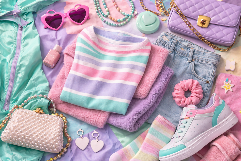
Pastels provided essential balance to the decade’s neon intensity. Lavender, mint green, baby blue, and blush pink offered softer alternatives that worked across diverse settings. These shades dominated casual wear, office attire, and home interiors, proving the 80s embraced chromatic variety beyond just fluorescent brights.
Casual and workplace styling favoured pastel sophistication. Button-down shirts in powder blue, lavender cardigans, and mint green trousers created professional looks that still felt contemporary. This versatility made pastels more wearable for daily life compared to attention-demanding neon pieces.
Pastels softened visual intensity when mixed with neon elements. Savvy stylists paired hot pink accessories with lavender bases or combined electric blue accents with mint green foundations. These combinations achieved the era’s bold spirit whilst remaining approachable for conservative contexts.
Interior décor embraced pastels extensively. Bedroom schemes featured coordinated lavender and pink combinations, whilst kitchens and bathrooms used mint green and peach tones. These choices reflected broader cultural shifts towards lighter, airier living spaces that rejected heavy 1970s aesthetics.
Balancing pastels with neon achieves authentic period aesthetics:
Use 70% pastel, 30% neon for wearable mixed palettes
Anchor pastel outfits with white or cream rather than black
Layer pastel tones in analogous schemes for subtle depth
Add metallic gold or silver to elevate pastel formality
Consider fabric texture alongside colour for richer interest
Pro Tip: Pastel vintage finds often show less obvious wear than neon pieces because lower dye saturation hides minor fading. Check stitching and structural condition carefully, as cosmetic appearance can mask underlying garment issues.
Discover additional retro 80s colour styling methods that demonstrate how pastels anchor diverse vintage looks. This softer palette proves the decade offered chromatic range beyond stereotypical bright excess.
Contrast and Pairing Principles in 80s Colours

Contrast defined 1980s colour philosophy more than any single shade. Neon paired with black or white amplified vibrancy whilst preventing visual overload. This principle appears throughout the decade’s fashion, graphic design, and interior styling, creating the high-impact aesthetic that remains instantly recognisable.
Contrast ratios in 80s designs often exceeded 70%, creating striking effects that grabbed attention in crowded visual environments. Magazine layouts, music videos, and retail displays all employed maximal differentiation between foreground and background elements. This approach influenced everything from album covers to shop windows.
Black anchored neon particularly effectively. The combination created electric pop that felt both edgy and sophisticated. Think neon pink blazers over black turtlenecks or electric blue accessories against black denim. These pairings let bold colours shine without competing elements.
White offered cleaner, sportier contrast. Pairing neon with white emphasised the activewear origins of many fluorescent pieces. This combination suited daytime contexts better than black-based schemes, reading as energetic rather than nightclub-oriented.
Soft pastels paired with neon created balanced palettes suitable for varied settings:
Lavender base with hot pink accents for feminine looks
Mint green foundation with electric blue highlights for fresh combinations
Peach core with lime green touches for unexpected sophistication
Baby blue anchor with neon yellow details for playful energy
Blush pink grounding with magenta pops for tonal depth
Design principles from 80s visual culture underpin successful pairing choices. Study period magazines, music videos, and advertising to understand how professionals balanced competing colour demands. These references reveal sophisticated systems beneath surface-level chaos.
Primary Colour | Best Neutral Pair | Secondary Accent | Typical Usage |
Neon pink | Black | Silver metallic | Evening wear, club fashion |
Electric blue | White | Gold metallic | Activewear, casual daytime |
Lime green | Black | Clear/white metallic | Statement pieces, accessories |
Lavender pastel | Cream | Rose gold | Workplace attire, tea dresses |
Mint green | White | Silver metallic | Casual shirts, home décor |
Explore proven 80s colour pairing strategies that demonstrate these principles in action. Mastering contrast transforms random colour choices into intentional, authentic vintage styling.
Iconic 1980s Colour Influences in Design

The Memphis Group pioneered the decade’s most influential design movement. Founded in Milan in 1981, this collective created furniture, textiles, and objects using geometric patterns in neon-pastel combinations. Their work rejected minimalist restraint, embracing maximal colour and pattern that defined postmodern aesthetics.
Neon and pastel geometric patterns have had lasting influence on retro home décor and vintage fashion inspired by the 80s. Memphis designs featured clashing colours, asymmetric forms, and bold graphics that challenged conventional taste. This aesthetic appears throughout contemporary vintage-inspired interiors and apparel.
Incorporating Memphis influences adds authenticity to modern vintage styling. Look for geometric prints mixing pastels with neon accents, laminate surfaces in unexpected colour combinations, and asymmetric design elements that reject symmetry. These details signal informed engagement with period aesthetics rather than superficial trend-chasing.
Neon and pastel combinations reflect Memphis’ playful colour use. The group intentionally paired colours that traditional design rules deemed incompatible. Hot pink with mint green, electric blue with peach, and lime with lavender all appeared in their work, expanding acceptable colour territory.
Understanding this context enriches vintage colour application:
Study Memphis Group catalogues for authentic pairing inspiration
Seek furniture and accessories featuring their signature squiggles and geometric forms
Apply their colour confidence to personal styling choices
Recognise how their influence extends beyond furniture into fashion and graphics
Appreciate the intellectual framework supporting seemingly chaotic combinations
Review comprehensive 1980s fashion inspiration that shows Memphis influences translated into wearable style. This design movement proves the decade’s colour choices reflected sophisticated aesthetic philosophy, not random excess.
Authenticity Indicators for 1980s Colours
Identifying genuine vintage colours requires examining fabric dyes, wear patterns, and material types. Modern reproductions use contemporary dye chemistry that produces different results than original 1980s processes. Learning these distinctions protects collectors from purchasing misrepresented items at vintage prices.
Fabric dye saturation reveals manufacturing era and methods. Authentic 80s textiles typically retain 70-80% of their original colour vibrancy after 30-40 years if properly preserved, showing characteristic fading patterns. Modern reproductions often show either too-perfect colour or artificially accelerated distressing.
Typical fading patterns unique to vintage 80s textiles include collar and cuff discolouration, sun-fade lines where garments hung, and differential fading between exposed and seam-protected areas. These signs develop naturally over decades and prove difficult to fake convincingly.
Common 80s materials supported specific colour fastness characteristics. Polyester held neon dyes brilliantly but yellowed with age. Cotton blends showed more even fading but lost saturation faster. Acrylic maintained pastel tones well but pilled noticeably. Understanding these relationships helps authenticate pieces.
Visual age signs help differentiate originals from reproductions:
Check for period-appropriate labels, care instructions, and sizing standards
Examine stitching quality and construction methods typical of 1980s manufacturing
Look for zipper types, button styles, and hardware consistent with the era
Assess overall garment proportions against documented period patterns
Compare suspected vintage items against verified authentic examples
Sourcing authentic vintage colours improves with specialist retailer relationships. Reputable dealers understand authentication markers and stake their reputation on accurate attribution. Review authentic 80s colour guidance from experienced vintage professionals who recognise genuine period pieces.
Situational Uses and Practical Styling Tips
Applying 80s colours effectively requires matching shade intensity to context. Bold neon colours suit nightlife and activewear contexts where maximal vibrancy creates appropriate impact. Save fluorescent pieces for settings that embrace theatrical self-expression rather than conservative dress codes.
Nightlife and activewear maximise neon vibrancy naturally. Dance floors, fitness studios, and social gatherings provide ideal environments for electric colours that might overwhelm office or casual daytime settings. These contexts expect bold choices that photograph dramatically under artificial lighting.
Pastels work beautifully for casual and workplace vintage looks. A lavender blouse or mint green cardigan nods to 80s aesthetics whilst maintaining professional appropriateness. These shades integrate easily into modern wardrobes, making them practical starting points for vintage experimentation.
Mixing neon with black or white prevents chaotic appearances. Follow the contrast principles discussed earlier, limiting bright colours to one or two garment pieces per outfit. Let neutral foundations anchor attention-grabbing elements rather than competing for visual dominance.
Metallic accents like silver and gold add dimensionality to both neon and pastel schemes. Gold jewellery warms pastel combinations, whilst silver accessories cool neon intensity. These metallics bridge colour groups effectively, creating cohesive looks from potentially clashing elements.
Practical styling follows these situational guidelines:
Assess your destination’s lighting and formality level before choosing colour intensity
Start with one vintage colour statement piece and build neutrals around it
Consider your personal colouring when selecting between warm and cool 80s shades
Test colour combinations in natural and artificial light before committing to outfits
Reference period styling through authenticated fashion magazines and photographs
Build gradually from subtle pastel incorporation towards bolder neon experiments
Invest in quality authentic pieces rather than accumulating reproduction quantity
Pro Tip: Photograph potential outfits under different lighting conditions before events. The dramatic appearance shifts between natural daylight, tungsten interior lighting, and LED or fluorescent sources help you anticipate how your vintage colours will read in target environments.
Explore comprehensive 80s styling approaches that demonstrate these principles across diverse contexts. Situational awareness transforms vintage colour knowledge into wearable, authentic personal style.
Comparison with Adjacent Decades and Market Value
The 1980s colour palette marks a dramatic shift from 1970s earthy tones. Where the 70s favoured harvest gold, avocado green, and burnt orange, the 80s embraced synthetic brightness and high contrast. This transition reflected broader cultural movements from naturalism towards technological optimism.
Vibrancy and saturation increased substantially from 70s to 80s. The earlier decade’s muted warmth gave way to electric intensity. This chromatic evolution mirrored advances in synthetic dye chemistry and changing textile manufacturing capabilities that made previously impossible colours commercially viable.
Transition to 90s saw muted palettes replacing bright neon and pastels. Grunge aesthetics introduced flannel plaids, forest greens, and burgundies that rejected 80s exuberance. By mid-decade, minimalist neutrals dominated fashion and interiors as cultural pendulum swung away from maximalism.
Authentic neon 80s garments command higher market value due to scarcity and collector demand. Well-preserved pieces, particularly designer items or unworn stock, fetch premium prices. Condition matters enormously, as neon dyes show wear more obviously than subtler colours.
Collectability is influenced by colour authenticity and rarity. Certain shades, particularly specific neon formulations, are nearly impossible to replicate with modern dyes. This scarcity drives collector interest and justifies investment in authenticated pieces over reproductions.
Decade | Signature Colours | Saturation Level | Typical Vintage Price Range | Collectability Factor |
1970s | Harvest gold, avocado, burnt orange | Medium-low | £20-£60 | Moderate |
1980s | Neon pink, electric blue, lavender | High | £40-£150+ | High |
1990s | Forest green, burgundy, grey | Low-medium | £15-£45 | Growing |
These pricing trends reflect current market conditions for authenticated vintage pieces in good condition. Designer labels, rare colours, and exceptional preservation command significant premiums beyond these baseline ranges.
Understanding historical context enriches appreciation:
70s colours feel dated partly because they dominated mass market so thoroughly
80s colours maintain freshness through association with counterculture and club scenes
90s colours are experiencing revival as that generation enters peak collecting years
Scarcity and condition affect pricing more than pure aesthetic appeal
Investment potential varies considerably across colour groups and item types
Review 1970s colour palette guidance for comparative context. This historical perspective clarifies what makes 80s colours distinctive and helps collectors make informed acquisition decisions based on long-term value and personal aesthetic preference.
Discover Authentic Vintage Homeware and Fashion

Apply your newfound 80s colour knowledge by exploring authenticated vintage pieces curated for quality and historical accuracy. Our collection features carefully selected items that embody genuine period aesthetics, from vibrant fashion statements to distinctive homeware that captures the decade’s design spirit.
Transform your living spaces with authentic vintage touches that honour 1980s colour principles. Discover pieces like this ornate atomic magazine rack that showcase period-appropriate metallics and geometric forms. Our mid-century vintage homeware collection offers diverse options for incorporating authentic 80s-inspired design into contemporary interiors.
Each piece in our collection undergoes careful authentication to ensure genuine vintage character. Whether you’re building a complete 80s-inspired wardrobe or adding selective accent pieces to modern spaces, our curated selection provides quality items that reward your investment with lasting style and historical significance.
Frequently asked questions
What are the main colour groups in the 1980s palette?
The 1980s palette divides into three core groups: neon, pastel, and metallic. Neon colours like hot pink, electric blue, and lime green dominated activewear and nightlife fashion. Pastels including lavender, mint green, and baby blue provided softer alternatives for casual and workplace contexts. Metallics like silver and gold added dimension and bridged other colour groups.
How do I pair neon colours without creating visual chaos?
Anchor neon pieces with neutral black or white foundations to amplify vibrancy whilst maintaining balance. Limit bright colours to one or two garments per outfit, allowing them to function as statement elements rather than competing for attention. Add metallic accessories to create cohesive transitions between bold colours and neutral bases.
What authenticity markers distinguish genuine 80s vintage from reproductions?
Authentic 80s textiles show characteristic fading patterns and typically retain 70-80% of original colour vibrancy after proper preservation. Examine fabric dye saturation, construction methods, and hardware types against period standards. Check protected areas like collar undersides for baseline colour comparison, and verify labels match 1980s manufacturing conventions.
Can I wear 80s colours in professional workplace settings?
Pastel shades work beautifully in professional contexts, offering vintage nods without overwhelming conservative dress codes. Choose lavender blouses, mint cardigans, or powder blue trousers that reference the era subtly. Reserve intense neon for casual Fridays or creative industries where bold self-expression aligns with workplace culture.
How did Memphis Group influence 80s colour choices?
The Memphis Group pioneered geometric designs mixing neon and pastel colours that traditional rules deemed incompatible. Their postmodern aesthetic rejected minimalist restraint, embracing maximal colour combinations that influenced furniture, fashion, and graphics throughout the decade. Understanding their design philosophy enriches authentic vintage colour application today.
What price premiums do authentic 80s colours command in vintage markets?
Well-preserved neon pieces typically range £40-£150+ depending on designer, rarity, and condition. Authentic 80s garments command higher prices than adjacent decades due to colour scarcity and collector demand. Specific neon formulations prove nearly impossible to replicate with modern dyes, driving premium pricing for authenticated vintage examples.
Recommended


Comments